Avanos Medical · ambIT®
UX Case Study · 2022–2023

Lead Product Designer · End-to-end ownership · Healthcare IoT

Designing for Safety
at Clinical Speed

Avanos needed infusion pumps, a mobile app and an enterprise dashboard to work as one system. Five front-line app roles would use it, every interaction had to meet FDA and EU rules, and the pump firmware could only send an update every 8 seconds. I designed across all three so clinicians could trust it as one system.

42%
Faster infusion setup
66%
Drug library update time
31%
Fewer programming errors
4.7/5
Clinician CSAT
Role
Lead Product Designer
Scope
IoT · Mobile · Enterprise SaaS
Core Tension
Speed vs Safety vs Compliance
Constraints
FDA / EU · RBAC · Legacy limits

The Critical Domain

Infusion Therapy

Infusion therapy is a patient safety problem first and a workflow problem second. A misconfigured pump, a missed limit or a rushed decision by a nurse at 2am can harm a patient, so there is almost no room for error.

Infusion therapy is how clinicians and care teams deliver medication directly into a patient's bloodstream, for example pain relief after surgery, chemotherapy, or antibiotics in the ICU. The pump controls the rate, the dose and the timing. If any of these is wrong, the patient is affected right away.

The old pump workflows were hard to use. Clinicians moved between disconnected screens, translated drug rules by hand, and re-checked limits the system should have caught. They did all of this under real time pressure, during actual shifts, not in a usability test.

That is the environment where errors happen. Clinicians were not careless; the tools made mistakes too easy to make.

In 2022, Avanos decided to fix this. The brief was to replace the old hardware setup with one connected system: an IoT pump, a mobile app for programming at the bedside, and an enterprise SaaS platform for managing drug libraries and devices. One system across three surfaces.

Systems thinking Workflow design Governance UX
The three forces
Healthcare IoT Mobile + SaaS Regulated UX
Speed vs safety
Nurses needed to get in and out quickly. Regulators needed every action to be recorded and defensible. Both needs were valid and neither could be dropped, so that tension shaped every design decision I made.
Five front-line roles, one system
Nurses, pharmacists, admins, OEM managers and site technicians each had different risk levels, different ways of thinking about the work, and different things that could go wrong. They shared one codebase and one component library. The challenge was making the product feel built for each of them.
Legacy constraints, modern expectations
The pump firmware sent its status every 8 seconds, and that could not change. The interface still had to feel responsive. This hardware limit shaped more design decisions than any stakeholder request.

My role

Lead Product Designer

I led design end to end as the Lead Product Designer. I owned the strategy, the system architecture, the clinical workflow design, the mobile interaction model and the final UI. I worked with a PM, an Axure architect and a full development team, and directed one offshore designer who supported production work.

Discovery: I ran clinician and technician interviews, workflow mapping, and risk/edge-case capture across multiple care settings.
System design: I built the RBAC matrix and the component architecture. The junior designers worked within that framework, and nothing was built outside it.
Prototyping: I built high-fidelity, clickable prototypes and tested them in realistic conditions: under time pressure, used with one hand, and in low light.
Delivery: I wrote the user stories and acceptance criteria and stayed in sprint planning, because design intent gets lost after handoff unless the designer stays involved.

The Challenge

Balancing Complexity and Compliance

The core balancing act

I had to balance clinical needs, regulatory compliance and one consistent experience across devices. Any two of these are hard to deliver together. I had to deliver all three, across IoT, mobile and enterprise web, while working within the limits of the old hardware.

FDA / EU RBAC Auditability Safety workflows Lifecycle tracking Legacy limits

Every design decision had to pass three questions: is it safe for the clinician, can I defend it to a regulator, and will it scale? These questions often pointed in different directions. Most of the design work was not in the screens but in deciding which constraint should win, and why.

Discovery

The Reframe That Changed the Roadmap

The roadmap I inherited was a list of features. It had no clinical input and no risk ranking; it was a backlog built on product assumptions. Before drawing a single wireframe, I paused and ran proper discovery: clinician interviews, workflow shadowing, and moderated usability sessions on early concepts.

The question that changed my direction was not "what should I build?" but "where are clinicians most likely to fail, and why?"

That shift had real effects. I cut fifteen percent of the backlog because it did not connect to any failure I had found, and moved that capacity to the three riskiest moments. It also became the basis of the RBAC model: permissions were built around clinical risk, not the org chart.

The Approach

Uncovering Constraints and Needs

Discovery ran on two parallel tracks: what clinicians needed, and what was technically possible.

Track 01
Contextual Inquiry

I interviewed nurses, anesthesiologists and post-op pharmacists across several care settings. I coded the sessions for failure patterns, not feature requests. The difference matters: feature requests show what people want, while failure patterns show what is actually going wrong.

Track 02
Constraint Discovery

I met with Engineering early, not to get sign-off, but to find the hard limits before I started designing: what could not change, what was fixed in the hardware, and what FDA and EU rules actually required compared with what people assumed they required.

The constraint that changed the most: the pump firmware could only send status updates every 8 seconds. That ruled out the "live status" dashboard I had been exploring. I switched to refresh-on-demand with optimistic UI, and nurses preferred it anyway, because constant flashing updates worried them more than they helped.

Needs by role
Conflicting priorities, resolved
Nurses
Fast, error‑resistant infusion programming workflows.
Physicians
Real‑time access to infusion data for clinical decisions.
Admins / Hospital Ops
Visibility into inventory, usage, and maintenance tracking.
Implication: the product needed role-based experiences and governance tools, not one interface for everyone.
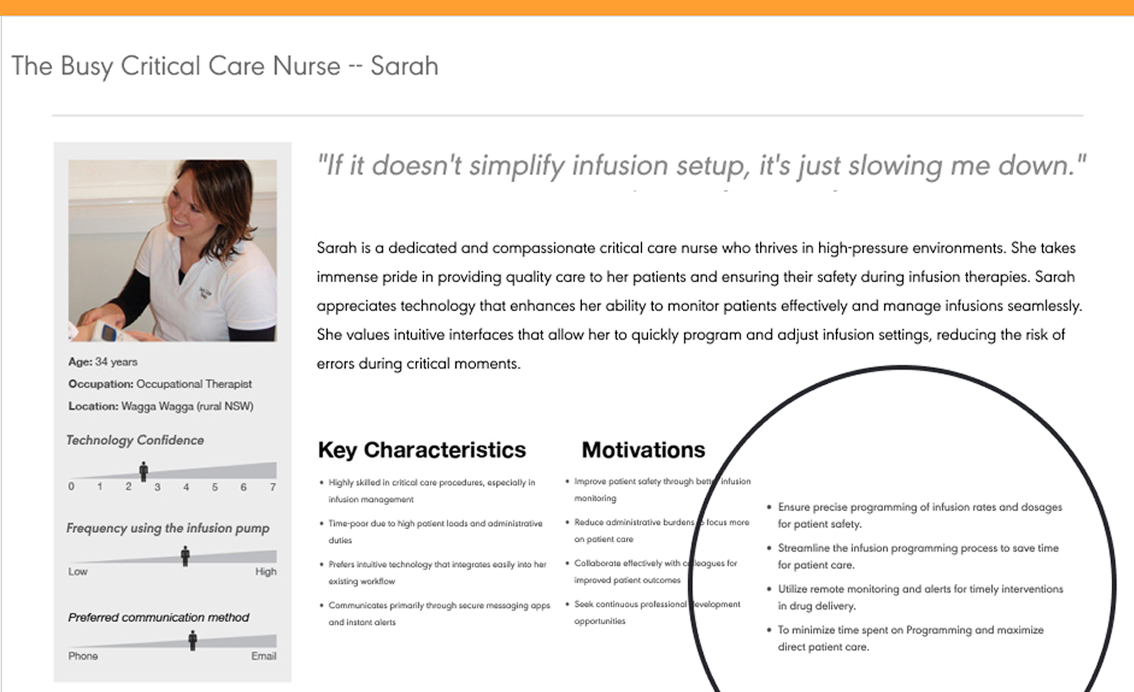
Persona: The Busy Critical Care Nurse, Sarah
Design stance

Move fast without giving up safety: show information step by step, show each role only what it needs, and check values when they are entered, not at the end.

🔎
Stop and reframe

I paused the roadmap and ran discovery first: interviews, shadowing and constraint mapping before any wireframes.

🧩
Design from risk, not features

I ranked every workflow by how risky a failure would be and how often the task happens, not by stakeholder requests or backlog order.

✅
Validate under pressure

I tested in simulated clinical conditions, with time pressure, one-handed use and high mental load, not in a calm lab setting.

Identified the User

Personas as Decision Tools

I used personas to make decisions. Nurses handled the riskiest workflows, so I designed infusion programming for speed and error prevention before touching any other surface. The personas came from 12 clinician interviews across 3 hospital sites. Before them, engineering had already specified one shared dashboard for all roles; the personas made the case for role-specific views before any screen was built.

Task
Frequency
Error Risk
Infusion setup MVP
HIGH
HIGH
Drug library edit MVP
MED
HIGH
Device tracking
MED
MED
Dashboard review
HIGH
LOW
Role provisioning MVP
LOW
HIGH
Audit / reporting
LOW
MED
MVP priority = High frequency OR High error risk

Understanding the Roadblocks

Frustrations and Pain Points

Three workflows carried the most risk: infusion setup, drug library management and device tracking. I focused on them not because of backlog order, but because a failure in any of them could directly harm a patient.

Drug Library Management
High‑risk configuration work
Drug Library Edits

Fear of entering an incorrect dose limit, with limited validation safeguards.

Reminders

Keeping drug libraries consistent across pumps and locations was hard to maintain.

Cognitive load

Large libraries made changes feel slow, risky, and mentally draining under pressure.

Site Infusion Dashboard
Signal vs noise
Grouping / Tagging

The system didn't match how teams organize drugs and devices in real workflows.

Search & Filters

Searching across massive lists took too long and increased time pressure.

Data noise overload

Dashboards did not prioritize anything, so users had to dig for the information they could act on.

Key Insight
"It's painful managing large drug libraries remotely. We're constantly worried about missing something because the system isn't intuitive. I need quick, actionable insights, but I end up digging through too much noise. If I make a mistake during drug entry or configuration, there's no easy way to catch it before it causes a problem."
1
What I heard

Pharmacists were afraid to commit drug library changes because nothing confirmed what they had just changed. They re-entered values by hand to double-check, which added 4 to 6 minutes to each update.

2
Design decision

I added real-time inline dose validation: the system flagged out-of-range values as pharmacists typed, not after they submitted. I also added a change summary before the final commit, so pharmacists could review exactly what had changed before it went to the pumps.

3
Measured outcome

In usability testing, this eliminated the manual re-entry behavior entirely. Drug library update time dropped from 15 minutes to 5 minutes, and dose override rates fell 22% in simulation testing compared to the baseline flow.

↓ 22% override rate in testing ↓ 66% update time

This insight became a design requirement: reduce uncertainty by surfacing the right signals, adding proactive validation, and designing safeguards that catch errors before deployment.

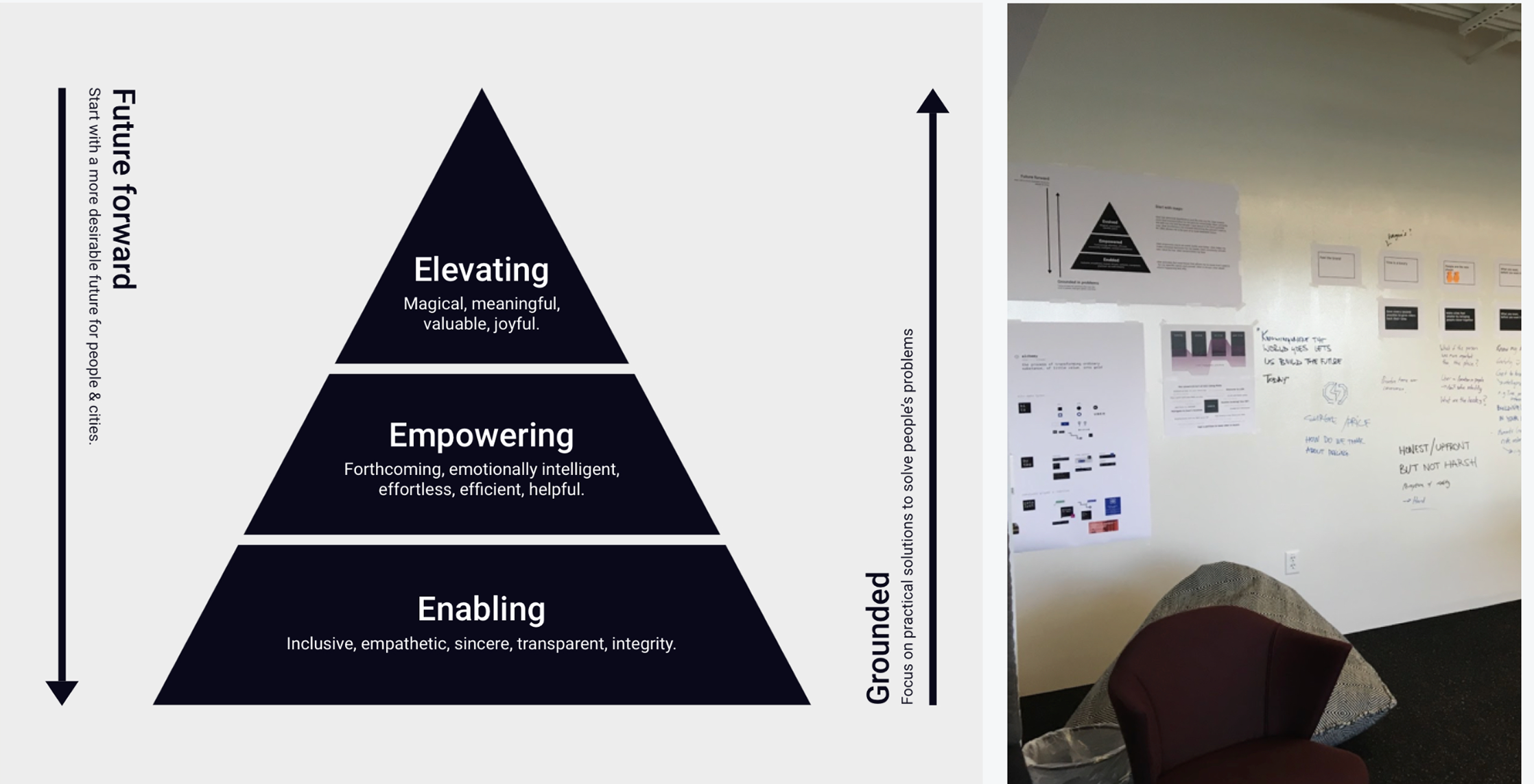
From Core to Foundation Focus

Foundation Before Features

I locked down reliability, compliance and data accuracy first. Later goals such as proactive alerts, real-time monitoring and wider integrations were scheduled after that foundation was stable, because clinicians will not trust a system that is not safe first.

Prioritization pyramid: Enabling, Empowering, Elevating

Before the first screen

Three Design Bets

Before any wireframe, I made three strategic bets: clear hypotheses about where design would have the most clinical and business impact. They shaped every tradeoff that followed.

1
Guided Infusion Workflow
Bet

Guiding infusion programming step-by-step with validation at each entry point would reduce errors without slowing nurses down.

Tradeoff

I tested a shortcut mode for experienced users, letting nurses skip steps they already knew well.

Decision

Under pressure, nurses skipped validation fields, not navigation steps. Clinical safety had to come before power-user flexibility, so the guided flow stayed mandatory.

Result
↓ 22% override rate ↓ 66% update time

No complaints about the guided flow in post-session interviews.
2
Role-Based Dashboards
Bet

If each role saw only the controls relevant to their workflow, cognitive load would drop and errors would follow.

Tradeoff

Engineering pushed for a unified dashboard with filtered modules to reduce build complexity.

Decision

Testing showed the unified model created noise: nurses saw admin controls, admins saw irrelevant clinical data. Role-specific views removed that friction entirely.

Result
↓ 38% error rate vs unified prototype

Task completion improved across all roles.

3
Compliance Interaction Model
Bet

If compliance was part of the interaction model from the start, not added later as extra steps, clinicians would follow it naturally.

Tradeoff

Early testing felt restrictive. I considered a warning-only model that would let clinicians continue and fix compliance issues after submitting.

Decision

I rejected it immediately. In a regulated device, errors found after submission can send unsafe drug libraries straight to live pumps.

Result
0 compliance workarounds post-launch

I presented compliance as a confirmation step, not a block, and clinicians accepted it without pushback.

From Personas to Jobs

Jobs to Be Done Shaped the Role Model

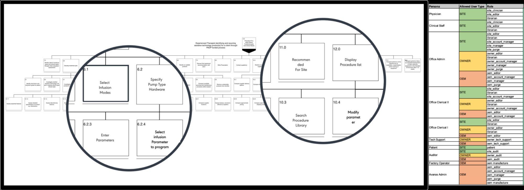
I translated each persona into the jobs they needed to complete, the information required to do them safely, and the decisions they were accountable for. Those job boundaries became the role and permission model, which I aligned with the security team and used as the source of truth for IA and component behavior.

Job Ownership

Mapping the critical jobs each user needed to complete: programming infusions, maintaining drug libraries, servicing devices, and governing enterprise settings.

Required Actions & Information

Defining what each role needed to see, decide, create, change, approve, or audit to complete those jobs safely.

Access Boundaries

Turning job requirements into the lowest permission level each role needed (view, edit, audit or admin) without showing actions that were irrelevant or unsafe.

The decision, and what I tried first

I first considered one shared dashboard that filtered modules by permission: one surface, with modules that changed by role. Engineering preferred it because it was simpler to build. In moderated testing it failed. Admins were overwhelmed by clinical data they did not need, and nurses were confused by governance controls they could not use. The shared model added noise at exactly the moments that needed focus. I chose fully separate role-based dashboards instead. They meant more design to maintain, but the 38% drop in task errors in moderated sessions made the tradeoff clear.

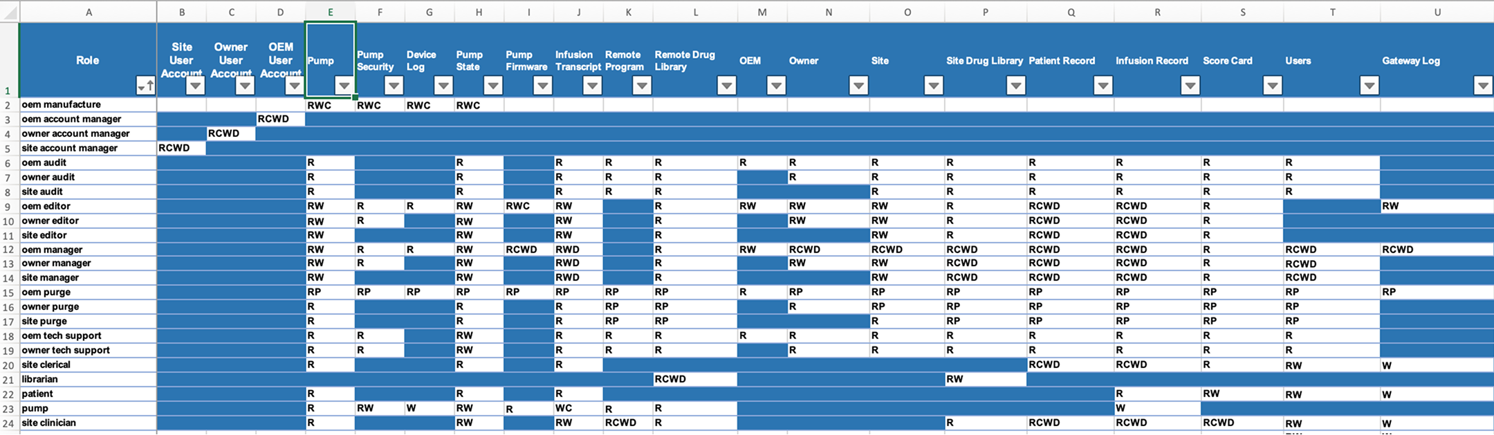
RBAC Permission Matrix 24 roles (the 5 front-line app roles plus all admin, operations and service roles) · 20 permission domains · R / RW / RCWD / RP
RBAC permission matrix: 24 roles mapped across 20 permission domains

Breaking Down the Workflow

From Features to Goal‑Based Task Analysis

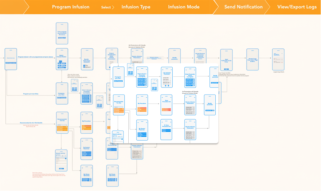
Instead of starting with features, I broke down the critical workflows for each persona using goal-based task analysis and role-based scenario mapping, so the UI followed how clinicians actually think under pressure.

The workflow model made it clear what the system should do first (recommended defaults and procedure lists), and what should be progressively revealed (mode selection, hardware constraints, parameter editing).

Design outcome

Guided, role-based workflow steps that match how each role thinks, with validation and audit trails kept close to the point of change.

Workflow Analysis Goal-based task analysis · Role-based scenario mapping
Goal-based task analysis and workflow breakdown

Architecture for Safety and Scalability

The Solution Strategy

I set the solution strategy by defining three structural pillars before any screen work began, so the platform architecture supported clinical workflows first, not the other way around.

Pillar 01
Workflow Optimization

I designed a simpler, guided infusion programming experience to reduce mental load during critical tasks. Real-time validation and early feedback helped clinicians catch setup problems before they became data entry errors.

Reduced friction at the point of action while preserving clinical safety guardrails.

Error mitigation Guided steps Validation
Pillar 02
Centralized Drug Library

I designed a central governance model for drug libraries to standardize complex, high-volume work across locations. Built-in help and simple editing tools helped pharmacists and administrators keep libraries consistent.

Faster rollout across hospital networks, with fewer configuration differences between sites.

Governance Consistency Scalability
Pillar 03
Role‑Based Interface (RBAC)

I used the RBAC matrix to shape each interface around a person's responsibilities. Clinicians saw only the programming functions their work depended on, while operations teams saw device lifecycle and compliance tracking.

The system could grow without overwhelming front-line users.

RBAC Contextual UI Auditability

System Thinking

How the Platform Connects

The three strategy pillars had to map to a real system. This diagram shows how people, screens, logic and storage connect across the platform. I built it before wireframes to agree with stakeholders on what "one platform" actually meant.

Layers
Device
People & Screens
Logic & Rules
Storage
Compliance
THE DEVICE PEOPLE & SCREENS LOGIC & RULES STORAGE COMPLIANCE & SAFETY Infusion Pump The physical device at bedside Hardware Wireless Link Sends status every 8 seconds Connectivity Offline Backup Keeps working if Wi-Fi drops Resilience Hospital Network Secure private connection Environment updates app feeds dashboard Nurse · Clinician Programs infusions on mobile Primary user Pharmacist Manages the drug library Governance role Biomed · OEM Manages device lifecycle Operations System Admin Controls access & permissions Access control OEM Reports Fleet visibility across all sites Multi-site every action checked first Permission Check Who can do what Based on clinical risk Always runs first Drug Rules Validates dose limits inline Flags changes before saving Safety gate Status Engine Processes device updates Triggers alerts on issues Real-time Alert Routing Right alert to right person Escalates if unacknowledged Notifications Record Keeping Logs every action taken Cannot be edited or deleted Audit trail permission check runs on every action → People & Roles Who has access to what Access records Drug Formulary All drug rules, versioned Versioned history Device History Every status update stored Time-series Action Log Permanent, tamper-proof record Cannot be deleted Hospital Isolation Each site's data kept separate Privacy boundary Patient Records Connect to hospital EHR Planned · future FDA Rules US medical device standard 21 CFR Part 11 EU Rules European device regulation MDR 2017/745 Patient Privacy Health data protection HIPAA Encrypted Data locked in transit & at rest AES-256 · TLS 1.3 Audit Report Exportable on demand Structured export EHR Connect Future patient record link Planned

* Dashed nodes and borders = planned post-MVP integrations. Solid nodes = shipped at launch.

Mitigated Clinical Risk

Applying UX Laws

Three principles guided every interaction decision. I used them as practical rules for a high-pressure clinical setting, not as theory.

ASZX

Hick's Law

Fewer options at each step. During infusion setup, every extra choice makes a nurse hesitate, so I cut options to cut errors.

Faster setup Lower error risk

Chunking

I broke complex workflows into steps clinicians could check one at a time, with no long scrolling forms and no walls of fields.

Progressive disclosure Step clarity

Peak‑End Rule

I designed confirmations and error recovery to feel calm and controlled, not alarming, because the last moment of a workflow shapes how much a clinician trusts it.

Trust moments Clean confirmations

Mobile-First Ideation

Why I Led With Mobile

Infusion programming was the most frequent and most risky task in the system, so it was the right place to start, and mobile was the right surface to start on.

The decision, and what triggered it

When I tested the desktop-first prototype with nurses on the ward, they held the tablet in one hand and reached with their thumb. The critical confirmation buttons sat at the top of the screen, completely out of reach. A mobile-first layout moved every main action into the bottom third of the screen, and roughly halved tap errors in follow-up sessions.

Mobile-first wireflow: infusion programming journey

Mobile App · Clinical Interface

Designed for the Point of Care

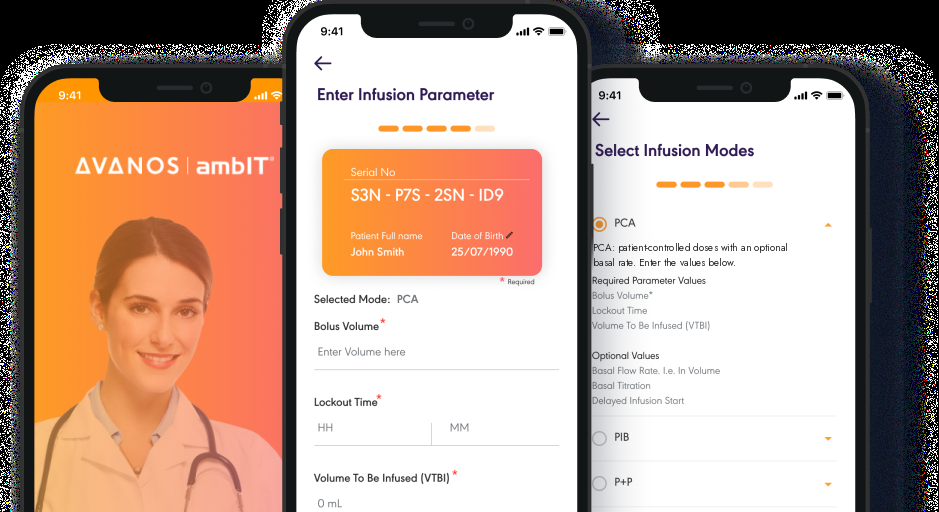
The mobile-first decision had a visible result. Every main action sits in the bottom third of the screen, within thumb reach. The app shows only what the clinician needs at each step, which lowers mental load during high-stakes programming.

Avanos ambIT mobile app: splash screen, Enter Infusion Parameter, and Select Infusion Modes screens

Splash → task in two taps

The branded launch screen opened straight into the active workflow, with no stop at a dashboard. Clinicians in the middle of a handoff landed directly in the programming flow from the home screen.

Patient identity locked at entry

The patient serial number and full name appear on the parameter entry card before any values are typed. Confirming the patient was the very first step, not an afterthought, which lowered the risk of programming the wrong patient.

Mode-driven progressive disclosure

Choosing the infusion mode (PCA, PIB, P+P) hid the parameters that did not apply. Bolus volume, lockout time and VTBI only appeared when the mode needed them, which kept the form short under pressure.

Scalable System Design

My decision

Scalable, Modular Component Architecture

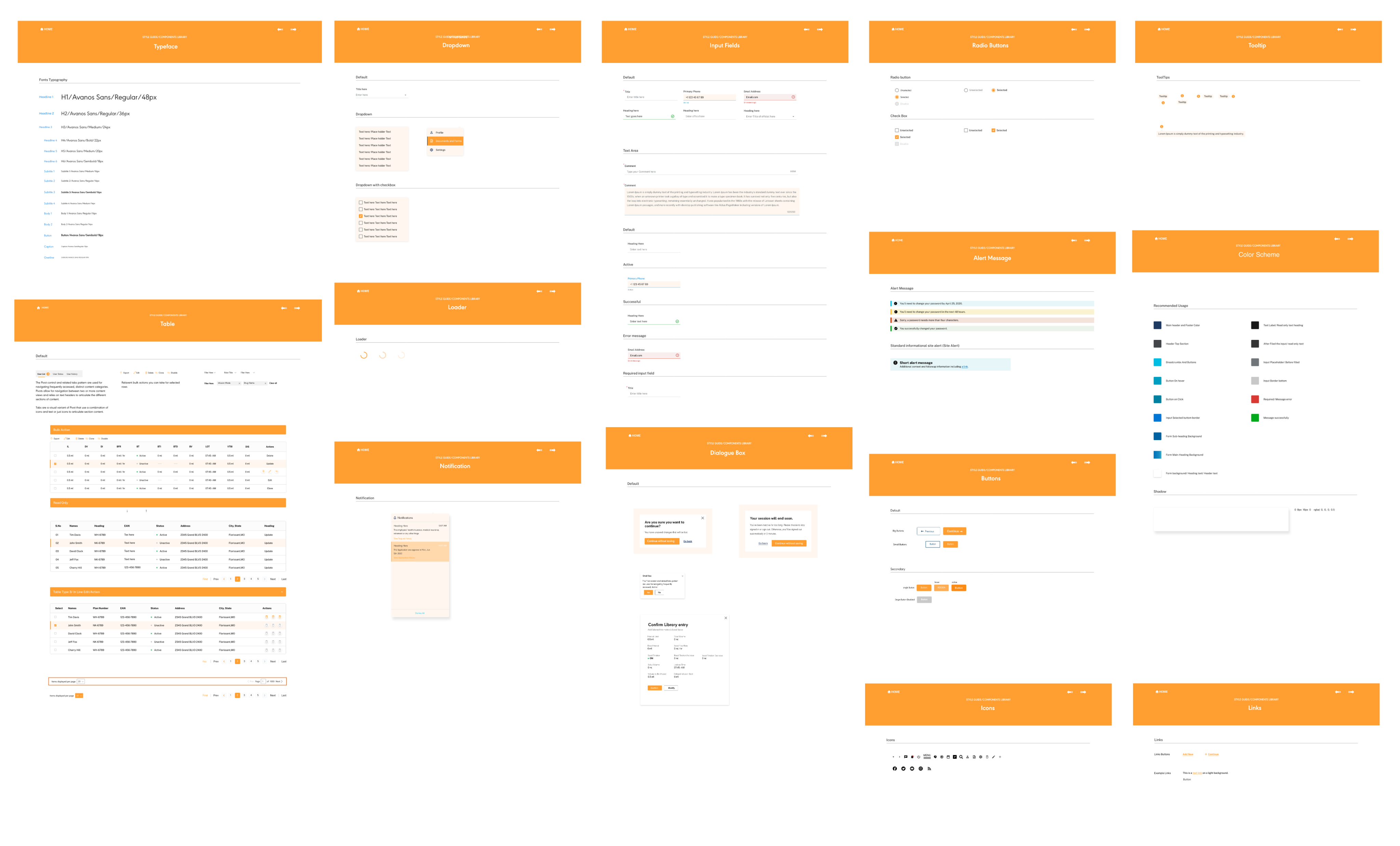
In a regulated clinical product, inconsistent safety patterns are not a polish issue; they are a compliance risk. The component library was how I enforced consistency. I documented fourteen components with their states, variants and usage rules, so confirmation dialogs, alerts and validation messages worked the same way in every workflow.

The RBAC model decided which components appeared and which actions were available for each role. One library served every persona, with governance built in from the start.

Clinical consistency

Safety patterns were fixed at the component level, so confirmation dialogs and alerts looked the same in every workflow and for every role.

Design velocity

Built once and reused everywhere. New features were assembled from existing components whose states were already designed.

Engineering contracts

Documented variants became the build specs. Each component was built once and reused across the platform, which meant fewer one-off solutions and fewer bugs.

RBAC-aware rendering

The same component behaved differently by role: an admin saw edit controls, a nurse saw read-only values. The role decided what was shown, not the screen.
Typeface Dropdown Input Fields Radio Buttons Tooltip Table Loader Notification Dialogue Box Alert Message Buttons Color Scheme Toast Links
Avanos ambIT component library: full system of documented UI components
Component Library: 14 documented components across all roles
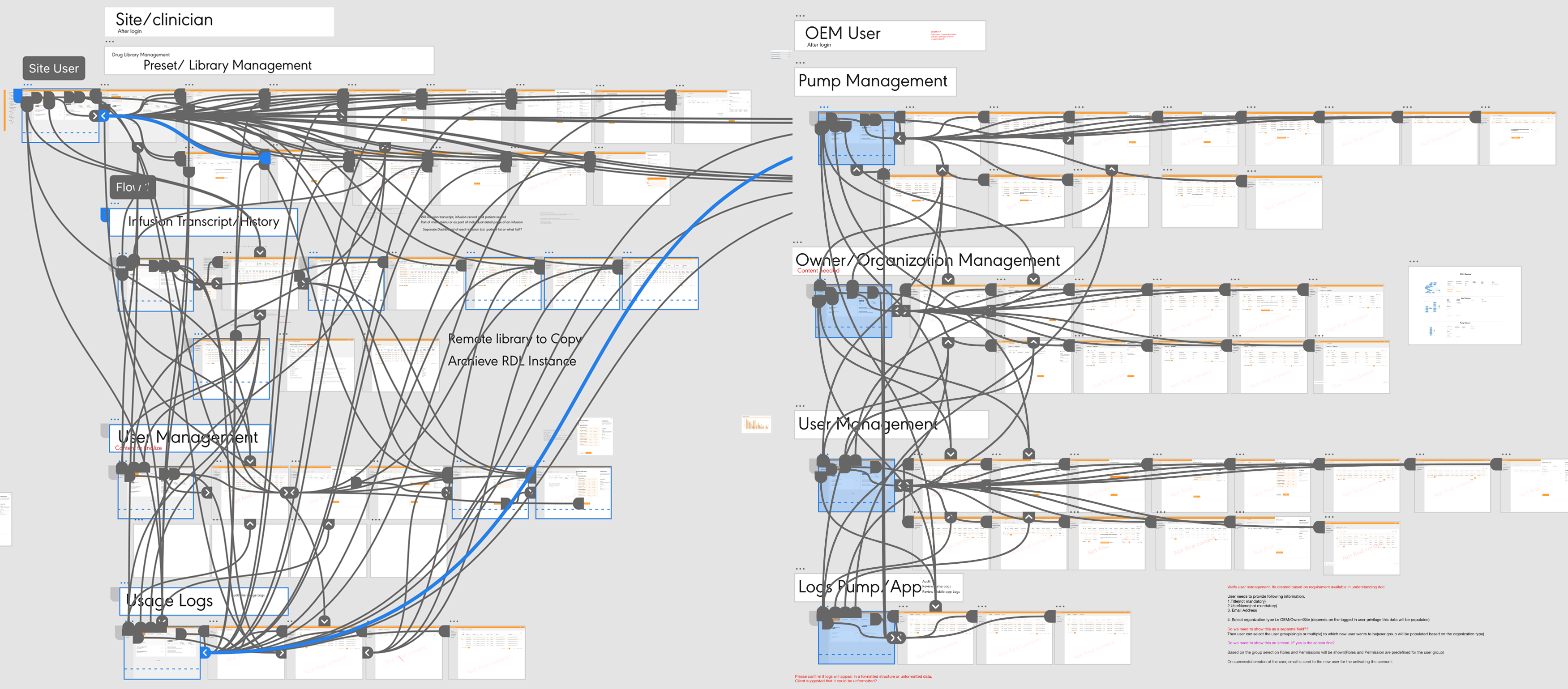
Full prototype map: all role flows connected
High-fidelity prototype map showing all role-based flows

Interaction Design

Interaction Patterns & Component Decisions

I chose and governed every component by one rule: reduce mental load at the moment of action. Below are the core patterns, why I chose each one, and the clinical problem each one solved.

💬
Coach Mark

Used to introduce unfamiliar screens or first-time workflows without interrupting the main task. It had a header, a short message and one action, so the instruction stayed brief and easy to dismiss.

Why it worked

New pharmacists learning drug library management needed context the first time, but permanent help text added clutter. The coach mark showed guidance once, at the right moment, and then went away.

🔀
Pivot: Tab Navigation

Used to switch between related views of the same record, such as User List, User Status and User History. Tab labels separate the sections without adding page-level navigation.

Why it worked

Clinicians needed to compare a patient's infusion history with their current status without leaving the page. Tabs kept every view in the same place, so clinicians no longer lost track of where they were.

⚙️
Filter & Command Bar

A paired toolbar. Filters narrowed large lists by relevant attributes, and commands showed bulk or record-level actions (Export, Edit, Delete, Clone) only when something was selected, so the default view stayed uncluttered.

Why it worked

Without this, admins managing more than 600 device records saw every possible action at once. Hiding commands until a selection was made kept the default view read-only and cut accidental destructive actions.

Governance Pattern

My decision

Role-Based Contextual Actions

Commands were never fixed. They appeared based on who was logged in, which record was open, and what that person was allowed to do, so actions a role should not take never appeared on screen.

Instead of greying out buttons for roles that could not use them, a common pattern that leaves people wondering why something is unavailable, I removed those actions completely. Each role's set of actions came directly from the RBAC matrix.

Commands lived in three places: Entity Nodes for drilling into records, Inline Command Triggers in table rows so routine actions did not need a pop-up, and Contextual Toolbars for bulk actions that appeared when rows were selected.

What this prevented

Nurses starting drug library edits, and admins opening patient-level infusion data. Both were gaps in the old system that broke the audit trail.

Role-Based Contextual Actions: Nurse View

Action Type
Task / Trigger
Based On Role
Appears Here
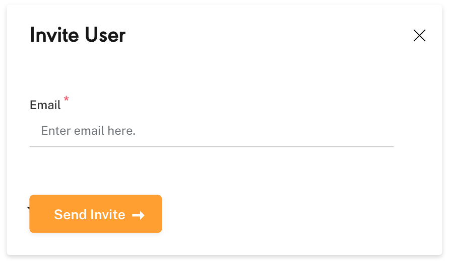
Invite UserSecondary: add team member to org
Triggered from User Management entity list
Enterprise Admin
Contextual toolbar: active when no row is selected
Register PumpSecondary: link device to org
Triggered from Device entity list or pump detail
Biomed Staff Admin
Inline row trigger + sliding panel overlay
Edit Drug EntrySecondary: modify dose limits
Triggered from Drug Library detail page
Pharmacist
Inline command trigger: edit mode on row selection
View Infusion StatusSecondary: monitor active pump
Auto-surfaced on Clinician dashboard landing
Clinician Nurse
Entity KPI strip: read-only, no edit trigger
Export / Clone RecordSecondary: bulk data operation
Multi-row selection triggers command bar
Avanos Ops Admin
Command bar: visible only when rows are checked

Entity Architecture

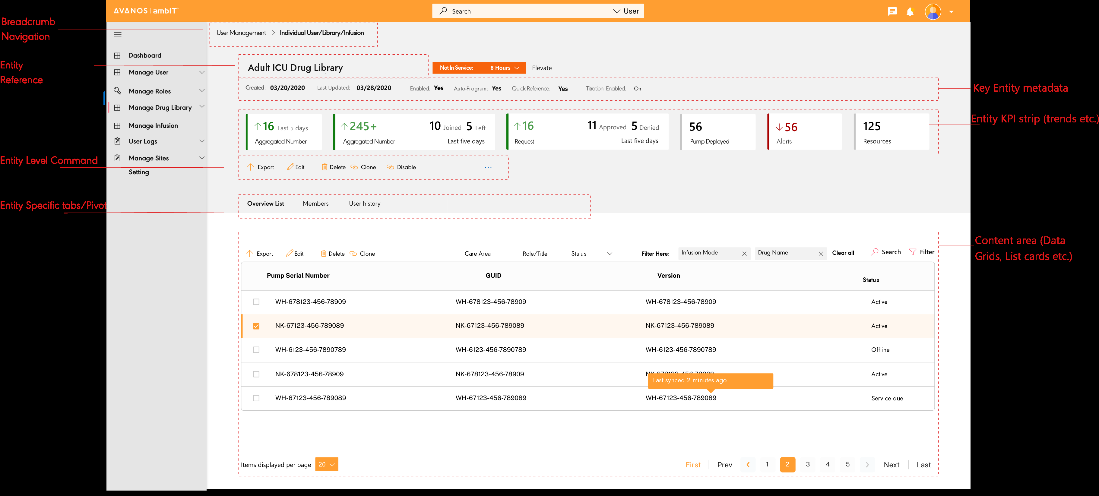
Content & Control Framework

The record layout followed one rule: show the right data and the right action at the right moment, and nothing more.

Content and control framework: annotated entity detail page
1
Breadcrumb Navigation

Spatial orientation across deep entity hierarchies without full page reloads.

2
Entity Meta + KPI Strip

Key details and live numbers sit at the top of the page, so users can see the system's state without scrolling.

3
Inline Command Triggers

Common commands sit inside the table rows, so routine actions do not need a pop-up.

Navigation Pattern

Multi-Step Overlay Sliding Panel

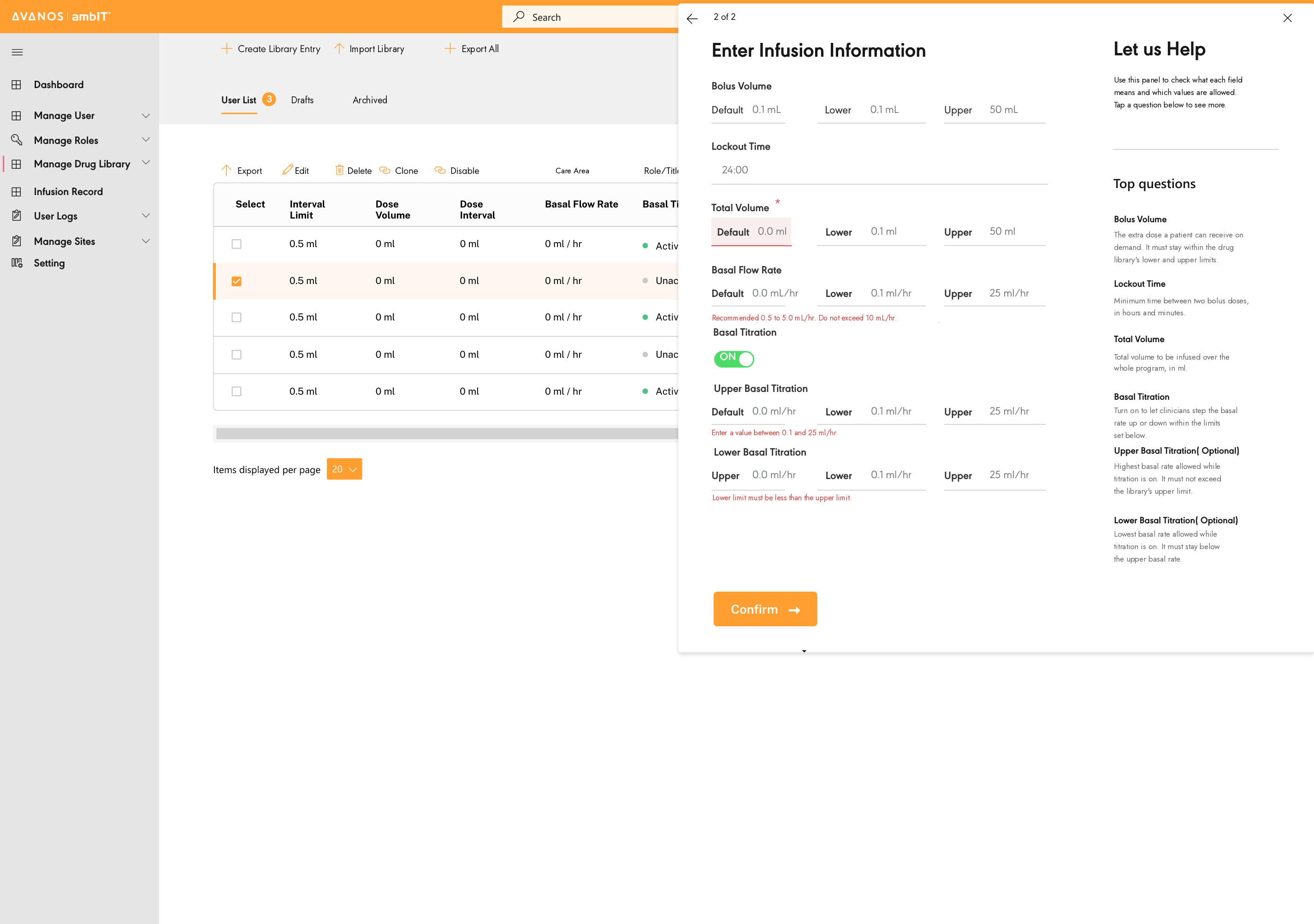
To support a busy, task-heavy clinical workflow, I designed a multi-step sliding panel. Users started from a list, opened a specific record, and completed tasks for it without leaving the main screen.

1
Trigger from entity list

Users picked an active device or patient from the main table. The background then locked, so no other record could be changed by accident while the task was open.

2
Panel slides in with the form

A side panel slid in from the right, limited to the selected record. Fields switched on one by one and stayed disabled until the previous step was confirmed, which prevented incomplete submissions.

3
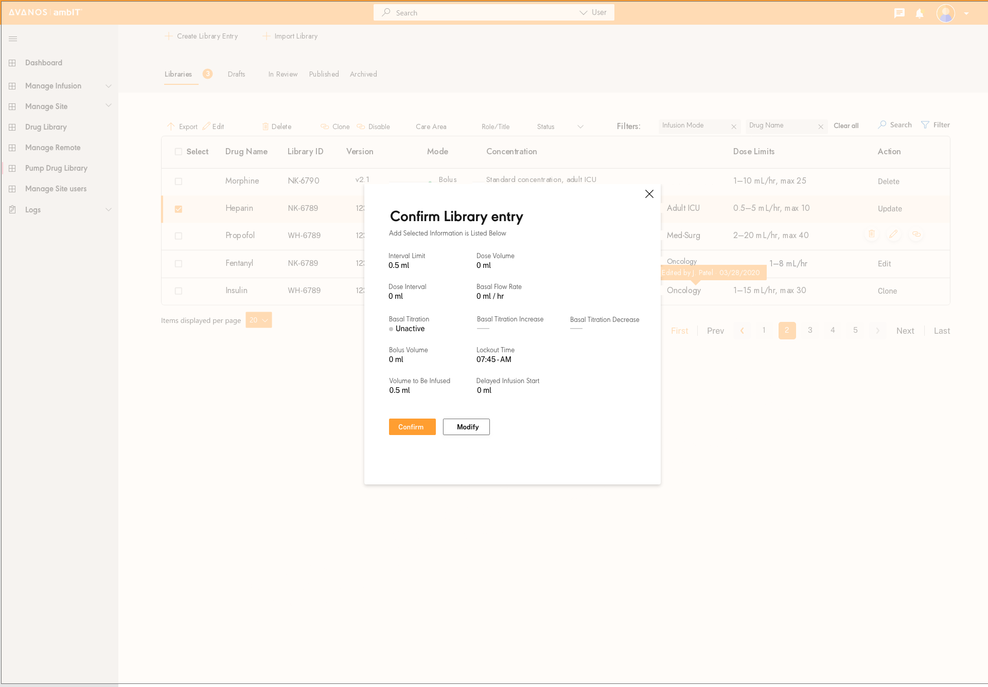
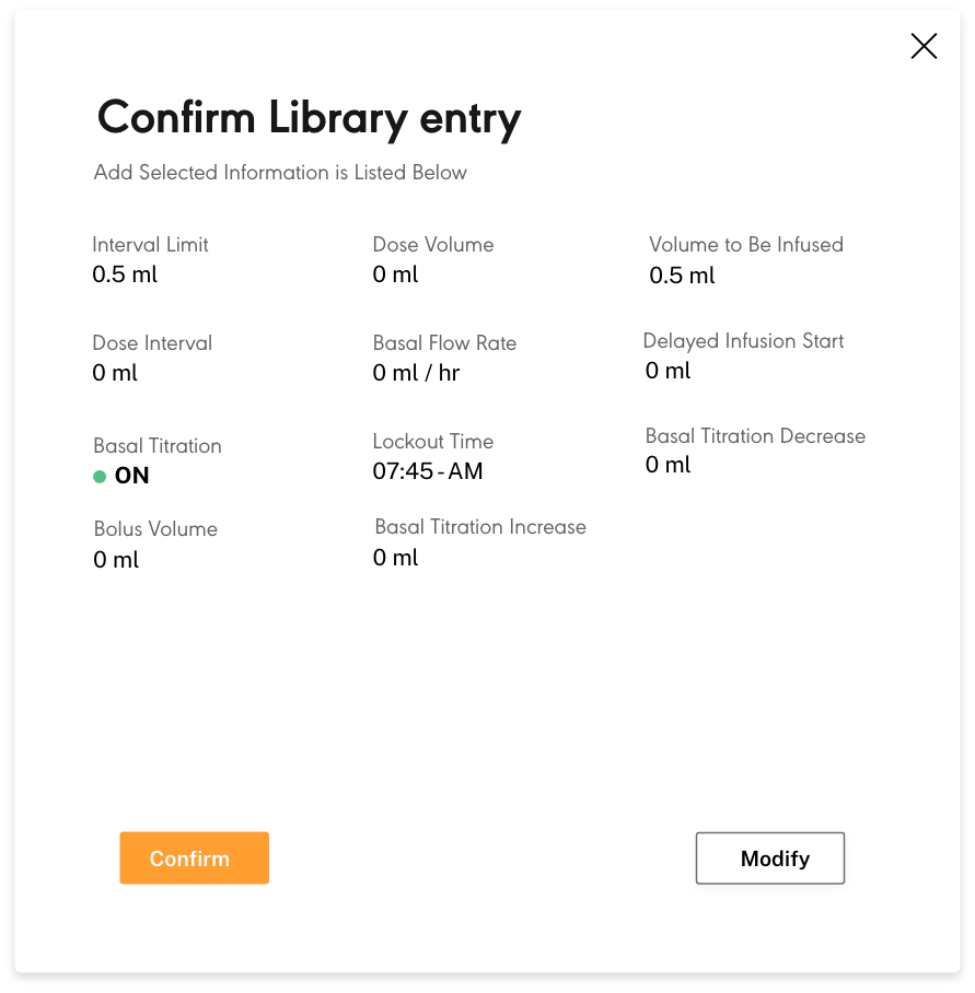
Confirm before commit

Before any change reached a live device, a summary showed every value entered, such as Interval Limit, Dose Volume, Basal Flow Rate and Lockout Time, on one review screen. There were only two choices, Confirm or Modify, so nothing was saved without the user seeing it.

Background lock

Removed distractions and stopped people from editing other records during a sensitive action.

Progressive fields

Fields switched on in order, so the form was completed in sequence and no validation step was skipped.

Context preserved

The main list stayed as it was, so users returned to the same scroll position and selection.

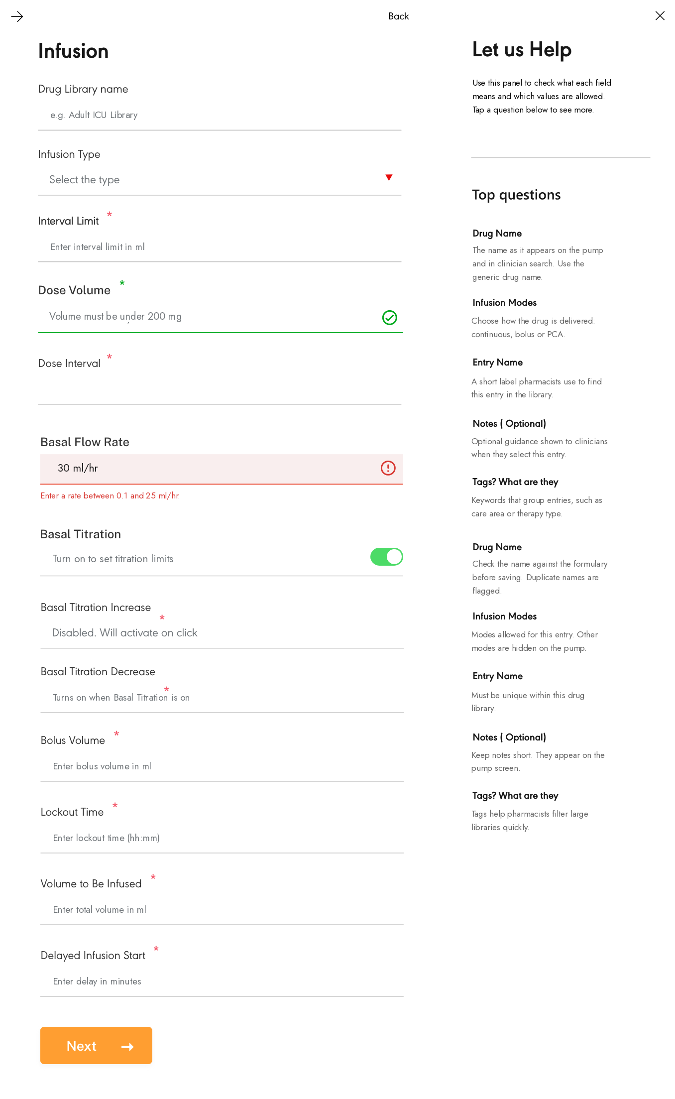
Help & visual cues

Each field had its own tooltip and visual cues, so help appeared when it was needed instead of being hidden in documentation.

Contextual help panel

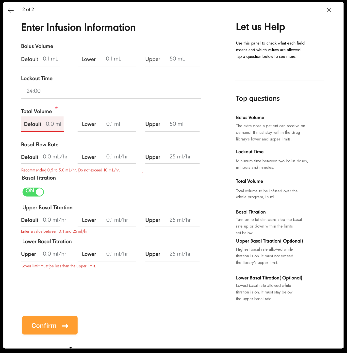
A "Let us Help" sidebar showed guidance for each field as users moved through the form, answering questions about Drug Name, Infusion Modes, dose settings and entry rules without leaving the workflow. This reduced the need for separate documentation and contributed directly to the 31% reduction in programming-related errors.

Clinical impact

Locking the background during a task removed distractions and kept the work in one place, which helped clinicians stay accurate and decide quickly in critical care. This pattern contributed directly to the 42% reduction in infusion setup time.

Sliding panel overlaying the entity list: background locked
Confirm Library entry: diff-style summary modal before committing to live devices

What the Panel Was Built to Prevent

Each design decision in the panel answered a failure I had seen in testing.

Sliding panel: Enter Infusion Information with contextual help
Inline validation, not submit-and-catch

Early prototypes showed all errors at submission, when nurses had already committed. Moving validation to the point of entry, with a "Do not exceed" message as they typed, caught errors while they could still fix them. That change drove the 31% error reduction.

One confirm button, nothing to second-guess

Fields switched on one at a time, so the form asked for one decision at a time. At the end there was a single orange "Confirm →" button with nothing competing with it. Testing showed that two buttons made people hesitate at exactly the wrong moment. One button, shown only after every check had passed, removed that doubt.

Interaction Safety Pattern

Contextual Task Escalation

I used stacked dialogs in a tightly controlled way to handle escalations inside the same workflow, so clinicians could deal with confirmations and safety alerts without leaving the screen or losing their place.

When configuring an infusion, users could trigger a secondary confirmation or dosage alert layered over the current panel. This kept the escalation tied to the originating action instead of redirecting users to separate pages.

This pattern achieved three goals: 1) it kept a clear order of actions, 2) it let users resolve critical safety steps immediately, and 3) it kept their attention on the task. Stacking dialogs in context reduced mental load while keeping decisions safe and in sequence during time-sensitive, high-risk moments.

Action hierarchy State preservation Safety escalation Sequential decisions
What this prevented

Switching between screens, losing entered data, and losing track of where they were during critical programming steps.

Pattern rules (regulated)
Hierarchy
Each layer escalates the same task, with no unrelated prompts or branching screens.
Resolution
Safety checks complete immediately, before the user can proceed.
State
All entered values remain intact across confirmations and alerts.
Escalation ladder (evidence)
Same workflow, with confirmations and alerts layered on top
1
Entry action (safe starting point)
Entry action: Organization type modal
2
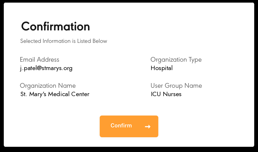
Confirmation layer (prevents unintended change)
Confirmation layer: Unassign pump confirmation
3
Final validation gate (forces review)
Final validation: Confirm library entry
4
In-context safety assist (help + alerts)
In-context safety assist: Enter infusion information with help panel

Validating the Experience

User Testing & Iteration

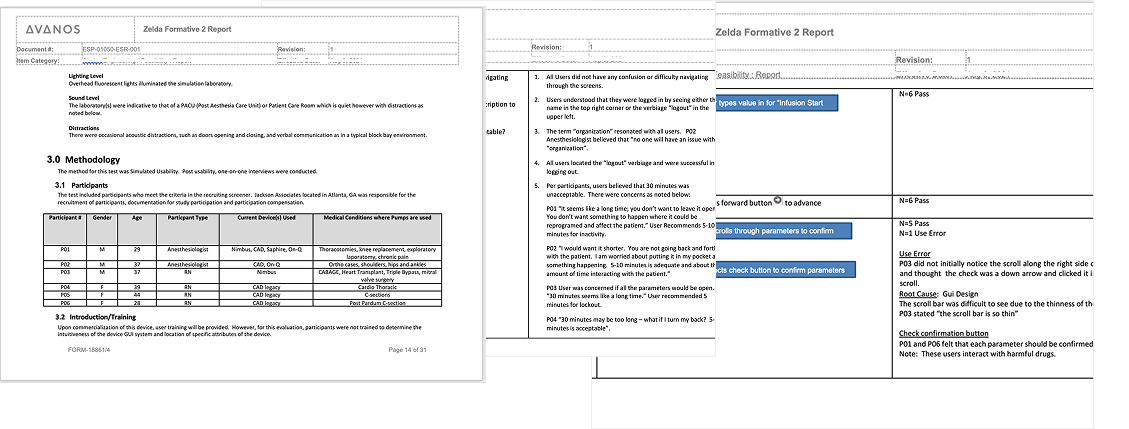
I ran moderated sessions, A/B tests and stress simulations, and fed the findings directly into the regulatory documentation for FDA review.

Zelda Formative 2 usability study report with participant data and findings
Zelda Formative 2 · Regulatory-Grade Usability Report

Moderated sessions with front-line nurses, anesthesiologists and post-op care specialists showed me where the design broke down in clinical conditions. A/B tests on the riskiest workflows showed me which direction to commit to. Stress tests under time pressure showed me the real mental load, not the load I had assumed.

All of it went into the compliance documentation for FDA review, so the testing was regulatory evidence as well as UX validation.

Testing Strategy & Impact
Moderated sessions A/B testing Stress simulations Cognitive load review Regulatory evidence
Who
Frontline nurses, anesthesiologists, post-op care specialists
Where
Simulated, time-sensitive environments mirroring real clinical pressure
Why
Validated safety + efficiency, and strengthened compliance documentation

A/B Testing · Drug Library Update Flow

I Tested Two Versions, and One Clearly Won

The drug library update flow was the riskiest workflow: pharmacists used it every day, and errors had regulatory consequences. I tested two different approaches before committing to the final design.

Version A
Control: Form-first
Hypothesis
Show the full edit form at once, so pharmacists could see every field before making changes.
What happened
Users spent significant time scanning to find the specific field they needed. Completion time averaged 15 min. Three participants submitted without reviewing the change summary.
Error rate
6 out-of-range entries across 8 sessions. No inline signal until form submission.
Version B
Redesign: Inline validation ✓ Winner
Hypothesis
Validate dose range in real time as the user types, and show a diff-style change summary before final commit.
What happened
Pharmacists caught and corrected their own errors before submitting. Completion time dropped to 5 min, and every participant reviewed the change summary before committing.
Error rate
Zero out-of-range submissions. Inline signals intercepted all flagged values before they were committed.
Why Version B shipped

The form-first version assumed pharmacists would check their own work, but under time pressure they did not. Version B removed that burden by catching errors as they were entered. It also gave pharmacists a review step before changes reached live devices, which the FDA compliance documentation required. Design, clinical and regulatory stakeholders all agreed to ship Version B.

↓ 66% task time (15 min baseline → 5 min) ↓ 100% reduction in out-of-range submissions ↑ 18% faster vs initial redesign
Decision point
The fork: inline validation vs. submit-and-catch

Drug library error handling came down to two options: check the entries on submit and show errors at the end, or check them as pharmacists type. Engineering preferred the first option because it was simpler and faster to build. I pushed back. I had watched pharmacists re-enter data by hand to check their own work, because the system gave no feedback until they submitted. The first option would have kept that habit in place. I chose inline validation. It took three extra weeks, and it is also why drug library update time dropped 66%.

The outcome

Enterprise SaaS: Role-Based Dashboards for System Control

Each role landed on a workspace limited to what it actually needed, with no unrelated controls and no noise from other teams' work.

Five distinct role-based dashboards

* Intentionally obscured per NDA

RBAC-aligned workspace
Clinician Technician Admin

Each persona, whether Clinician, Technician or Admin, landed on a workspace built around their permissions and main responsibilities, with the key actions and information in view.

Clear landing
Primary actions and system status surfaced first.
Permission-led IA
Navigation and modules load based on role.
Scalable modules
Reusable dashboard blocks for future teams and features.

Outcome

Measurable Impact

These numbers come from moderated testing and early pilot deployments. Here is what actually changed.

All metrics measured during moderated usability testing and early hospital pilot deployments. Timed task completion and error logging conducted under regulated study conditions.

42%
Faster infusion setup

Programming time dropped from 12 min to 7 min. This came from the mobile-first layout, which put every main action within thumb reach, and from fields that switched on in order, so no validation step was skipped.

Measured in moderated usability sessions with 14 clinical staff across 2 pilot sites. Timed task completion, pre vs post redesign.

66%

Drug library update time dropped from 15 min to 5 min. This came from real-time inline dose validation and the change summary, which ended the habit of re-entering values by hand to check them.

Measured via task timing in A/B usability testing with 8 pharmacists. Version B (inline validation) vs Version A (submit-then-validate).

31%

Fewer programming-related errors. This came from the help panel, which gave guidance at the moment of entry instead of in separate documentation, and from the confirmation step, which stopped changes from being saved without review.

Error rate measured in Zelda formative usability study (regulatory-grade). 18 participants across nurse and pharmacist roles. Errors logged per task step.

4.7/5

Clinician CSAT. This came from role-specific dashboards and RBAC-governed actions: nurses saw only what their workflow required.

Post-session satisfaction survey (SUS-derived, 5-point scale). Collected across all pilot participants at end of moderated sessions.

"The new system finally understands how we work. I no longer worry about making a mistake when I'm in a hurry."
Sarah, ICU Nurse (pilot site)

User Stories

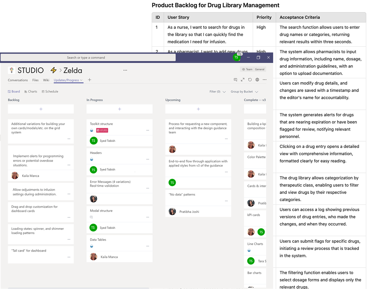
Product Backlog

My design ownership continued after handoff. I stayed in sprint planning, wrote acceptance criteria, and kept Engineering aligned with what was agreed in discovery.

Backlog artifacts: stories, priorities and acceptance criteria
User stories Sprint planning Refinement
Product backlog board and drug library management acceptance criteria
I used the backlog to keep scope clear, map stories to regulated workflows, and keep Engineering aligned on quality and acceptance criteria.

Final UI

Final Screens

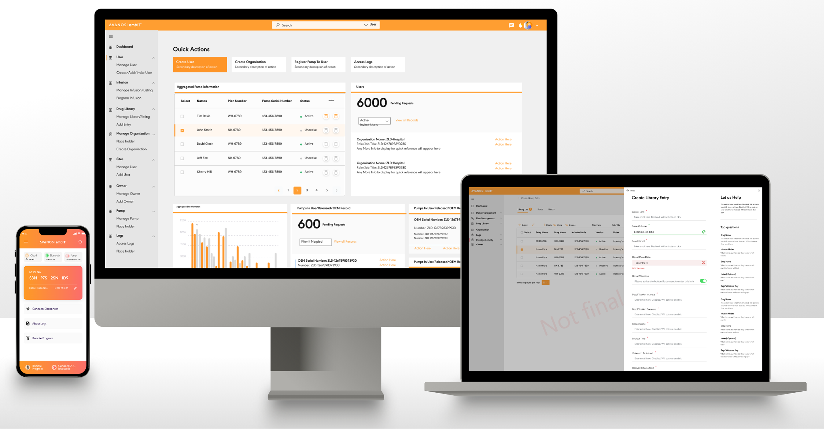
Production UI across the whole system: enterprise SaaS, drug library governance and the clinical mobile app.

Avanos ambIT: full ecosystem across desktop, laptop, and mobile
Enterprise SaaS + Mobile
Connected Ecosystem: Dashboard, Governance & Mobile

The full platform across devices: the OEM admin dashboard with quick actions and pump totals, drug library governance with the sliding panel entry form, and the mobile app connecting directly to the pump. One system, three surfaces, and no confusion about who can do what.

Role-based dashboards Drug library Mobile app RBAC
← Back to Work