AI hallucinations
"The model looks great. That isn't our shoe."
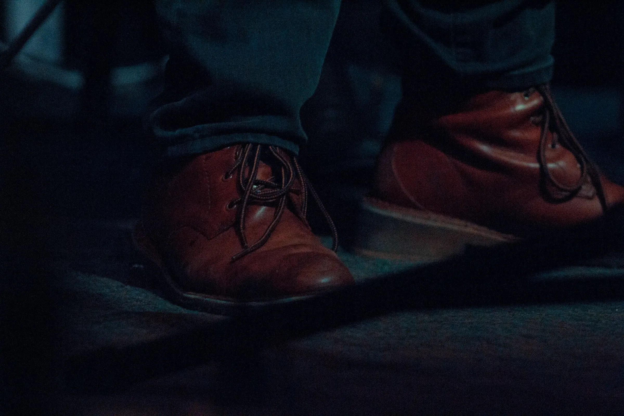
AI tools hallucinated product details in most outputs. Toe shape, broguing, welt and sole were the usual losses.
68%of AI outputs had visible shoe-detail hallucinations
Traditional footwear shoots were slow and costly for catalogues of 5,000+ SKUs and frequent releases. Generic AI looked faster, but repeated generations wasted tokens and hallucinated shoe details. OnFoot made on-model imagery scalable around one rule: change the model, outfit and scene, never the shoe.
Deloitte’s Seeing Is Believing report on AI-powered virtual styling sparked an idea. I explored the market and found footwear was largely overlooked. Talking with manufacturers and graphic designers revealed costly photoshoots, wasted AI generations, and hallucinated shoe details. I developed OnFoot AI to solve this, cutting production from 3–4 weeks to under a minute, at $0.003 per generation versus $80–150 for photography, with an 87% average shoe match. Guided briefs reduced retries, while accuracy checks caught AI hallucinations.
Focus on the overlooked footwear niche: reduce wasted generations, make AI product errors visible to designers, and deliver accurate on-model imagery at scale.
Lead product designer. Research, strategy, interaction model, design system, and the case that changed the roadmap.
How I changed minds · Decision log · AI trust · What I'd do differently
A Deloitte report inspired me to explore practical AI value. I identified footwear: expensive shoots, vast catalogues and designers losing time and tokens as generic AI hallucinated shoe details.
What began as a solution for one manufacturer became footwear-specific SaaS: guided briefs instead of long prompts, two takes per run, internal shoe-match checks, plus shared workspaces, usage controls and approvals.
Lead product designer on a cross-functional team of seven. I led the market and user research, UX strategy, the interaction model and the design system, from discovery to beta.
OnFoot turns a brand's existing product photos into on-model photography: a real-looking person wearing the exact shoe, in a chosen outfit and scene, sized for the channel it's going to.
Footwear brands rely on packshots because model shoots are expensive and slow. Market research showed AI on-model tools mostly served clothing. Manufacturer conversations confirmed the gap: generic AI made attractive scenes but changed shoe details, and repeated prompts consumed tokens without reliable results.
I led design for OnFoot from the first market scan to a paid beta, working with product management, engineering, ML and QA, and with three footwear companies as design partners. This case study walks through what the research found, the decisions behind the product, and why each one was made.
I worked through research, design and build side by side. I tested concepts against design partners' products and real model outputs each week, so my designs stayed grounded in what the AI could deliver.
OnFoot was built by a cross-functional product team of seven, with three footwear companies as design partners. I led design and research; decisions were made together and written down with an owner.
Footwear emerged as the gap: apparel tools prioritized clothing, while manufacturers needed their actual shoes preserved.
I began with a Deloitte report on the gap between AI experiments and business value. My scan of the on-model imagery market found plenty of tools for clothing, but little built around footwear accuracy. I contacted manufacturers to test whether that gap was real.
Strong for clothing. Shoes are treated as part of an outfit, not the product being sold.
Fast and cheap. Footwear, where listed, is one input among bags and jewellery, with no product-accuracy check.
Flexible, but every image starts from a prompt, every retry costs tokens, and nothing checks the shoe.
Tools grouped by their public product positioning, October 2026. Test results below are reported by category, not by vendor.
Mapped 14 AI on-model and image tools by category, input type, pricing and what they promise about the product.
2 days · desk researchRan 60 real SKUs from the design partners through each category, scoring whether a buyer would notice the shoe had changed.
1,080 generations18 people at 9 footwear companies: e-commerce, merchandising, creative and design leads, and the people who own the budget.
45–60 min eachReviewed three months of AI subscription and token invoices from four design teams, matched against how many images were actually used.
4 teams · 3 monthsShoes came back with a different toe, sole or stitching in most outputs. The tools were tuned for drape and fit of fabric, not the structure of a shoe.
Designers using generic LLM image tools rewrote prompts about 11 times per usable image. Every retry was paid for.
Across the four teams, most of the AI spend went on images nobody could use, spread across personal accounts nobody could see.
At 5,000+ SKUs and a release every few weeks, shoots only ever covered the hero products.
Manufacturer conversations made the opportunity concrete: designers were spending tokens on repeated prompts and still getting the wrong shoe. Footwear needed a repeatable workflow, measurable accuracy and predictable cost—not another generic image tool.
Online footwear listings often rely on packshots: a shoe on white. On-model imagery shows how a real product looks with clothing, but traditional shoots are too slow and expensive to cover every release. Generic AI offered a shortcut, yet it changed shoe details and consumed tokens through repeated attempts. Designers needed a reliable way to produce and verify the image before publishing.
Footwear businesses need on-model images for 5,000+ SKUs and every new release, but shoots cover a fraction of it, and the generic AI tools their designers use change the product and waste tokens on retries, so most listings ship with packshots only.
How might I help footwear brands put every product on a model in minutes, preserve shoe accuracy and make AI spending predictable?
Generic AI can make a convincing picture while hallucinating product details: distorting the toe, stitching, sole or materials. Longer prompt-and-retry sessions made it harder for designers to keep the product consistent. The person, outfit and scene could change; the shoe could not.
“Use AI to make model photos” sounded like the obvious shortcut. But manufacturers described long prompt sessions, wasted tokens and shoes that no longer matched the original. I traced those failures back to the workflow before deciding what to design.
94% of footwear listings in my audit lacked on-model imagery.Packshots show the shoe, but not how it looks when styled and worn.
On-model photography costs too much to cover a catalogue.A shoot day covers 15–20 products; a 5,000-SKU catalogue with colourways needs more than 800 shoot days a year.
Footwear multiplies variants faster than any other category.Every design × colourway × width × finish is a separate product, and new releases land every 2–3 weeks.
AI should break the per-variant cost, but teams abandoned it or kept paying for nothing.7 of 9 companies had tried apparel AI tools and dropped them; design teams kept generic LLM tools and burned tokens on retries.
The AI hallucinated product details, and nobody could tell how often.Generators optimise for a plausible picture, not a faithful product. Checking every image by eye was slower than a shoot.
There was no dependable way to verify AI-generated shoes at catalogue scale, or to start without writing prompts.Making an attractive image was easy. Preserving the real shoe and finishing the work were not.
What full on-model coverage would cost a 5,000-SKU footwear retailer from my interviews.
5,000 SKUs × 3 colourways ÷ 18 per day × $2,400 per dayOne design team's generic AI subscriptions and tokens, with 82% of generations never used.
23 designers · $14.6k a month · 3 months of invoicesAdd-to-cart rate of listings with on-model images versus packshot-only, across audited brands.
240 listings · 30 brands · public review counts as proxy| Problem | E-commerce manager | Design team | Head of digital | Shopper |
|---|---|---|---|---|
| Cost of coverage | Budget gone by spring | Not their budget | Shoot spend | Not visible |
| AI hallucinations | Brand risk | Wasted work | Legal & returns | Returns |
| Token waste | Slow output | Endless retries | Untracked spend | Not visible |
| Channel sizing | Daily chore | Manual crops | Consistency | Bad crops |
Severity by role. AI product hallucination is the only problem every party feels, which made it the design centre.
The problem was never just making an image. It was preserving the actual shoe while keeping retries and costs under control.
I spoke with the designers who make listings and the people who pay for them, then checked the findings against real AI outputs using the design partners' products.
AI tools hallucinated product details in most outputs. Toe shape, broguing, welt and sole were the usual losses.
One usable image took long trial and error. Most sellers stopped after a few tries and went back to packshots.
Square crops cut the feet off portrait shots. Stories needed 9:16 and nobody generated for it.
| Option teams used | Product accuracy | Speed | Cost per image | No prompting | Channel-ready | Review step |
|---|---|---|---|---|---|---|
| Model photoshoot | Exact | 3–4 weeks | $80–150 | Yes | Manual | Photographer |
| General AI & LLM image tools ChatGPT, Gemini, Midjourney | Often changed | Seconds | Cents × 11 retries | No | No | None |
| Apparel AI model tools Botika, Claid, FASHN, Modelia | Clothing-first | Minutes | $1–3 | Partly | Some | None |
| E-commerce photo editors Photoroom, Pixelcut | Unchanged | Seconds | Cents | Yes | Yes | No model |
| OnFoot | Checked every take | < 1 minute | ~$0.20 | Yes | Built in | Scored |
Competitive landscape by category, from public positioning and my footwear stress test. The gap: nothing combined a real model with a check on the product, at a cost a business could control.
Teams needed a dependable image workflow: preserve the real shoe, avoid repeated prompting, flag inaccurate takes and make generation costs predictable.
I coded every interview into single-observation notes and sorted them in FigJam with the PM and engineering lead, without naming groups first. Five clusters came out. Bar length shows how many of the 18 participants raised each one.
Across the clusters, designers did not need prettier AI images. They needed a dependable way to spot changed shoe details, stop unnecessary retries and approve usable work.
Before designing the UI, I listed the assumptions the product depended on and tested the riskiest ones with low-cost experiments. Two proved wrong, and I changed the design accordingly.
| Assumption | Risk | How I tested it | What I learned | Status |
|---|---|---|---|---|
| A better image model will prevent hallucinations | Ran the same 30 shoes through four models with tuned prompts | Best model still hallucinated shoe details in 1 of 3 images. Model quality alone can't close the gap. | Invalidated | |
| Teams will review every image by eye | Gave 6 people 40 images each, timed and scored their reviews | Accuracy fell to 61% after 15 images. People stop looking closely. Review has to be automated. | Invalidated | |
| Multiple reference angles improve fidelity | 1 vs 3 reference photos, 60 shoes, blind human rating | Average match rose from 6.4 to 8.1 out of 10. Asking for more photos is worth the friction. | Validated | |
| Non-experts can direct a shoot without prompts | Paper brief with 6 choices vs free-text prompt, 8 people | Brief users matched the target image 7 of 8 times; prompt users 3 of 8. | Validated | |
| Shoppers accept AI-generated models | Listing A/B with disclosed AI images on a design partner's site | No drop in trust signals, add-to-cart up. Disclosure didn't hurt as long as the shoe was right. | Partly | |
| An AI can judge product match reliably | AI judge scores vs 3 human raters on 400 takes | Strong agreement (r = 0.81) with a few known blind spots. Good enough to flag, not to auto-delete. | Partly |
The two invalidated assumptions are why OnFoot has an automatic match check instead of a better prompt box.
In an enterprise, on-model imagery isn't one person's job. It moves through content, merchandising, catalogue and marketing teams, and is governed by brand and legal. Each role brought its own problem, and OnFoot had to solve for all of them.
When a new shoe or colourway is ready, I want accurate on-model images for each channel, so I can publish without a new shoot or repeated AI retries.
Current-state journey for a footwear e-commerce team, built from interviews. Each pain became a design opportunity.
Each round of research made the problem narrower and more useful. The final framing is what every later decision was measured against.
How might I generate on-model photos with AI?
Why it fell shortGenerating was already solved. Teams had the tools and had stopped using them.
How might I make AI footwear photos more accurate?
Why it fell shortNo model is accurate every time. Chasing accuracy alone left teams checking by eye, which they couldn't sustain.
How might teams know, for every image, whether the shoe is theirs, without needing AI skills?
What it unlockedVerification and access became the product. Generation became an ingredient.
Swap the prompt for a simple brief, and have the tool say when it isn't sure.
Each principle comes straight from a research finding, and each one maps to something you can point at in the product.
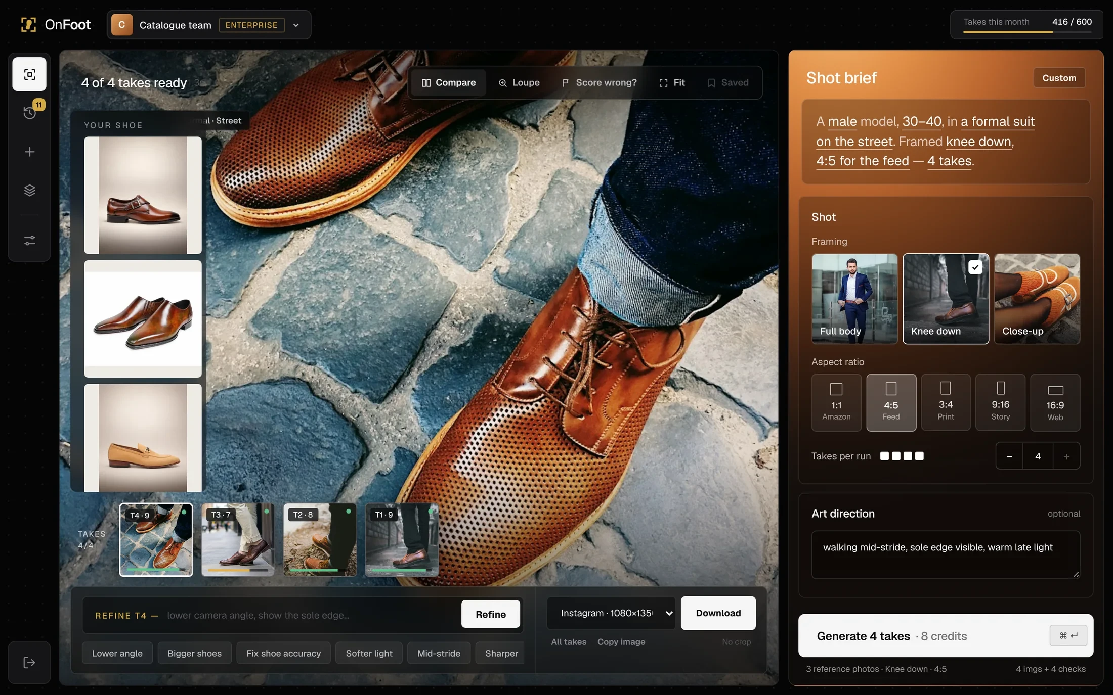
Getting the shoe right matters more than a pretty scene. Up to four reference angles go into every request, the prompt locks the design, and Compare puts the real shoe beside every take.
Product hallucinations were the top reason teams abandoned AI.
Multi-angle references, locked prompt, Compare and Loupe.
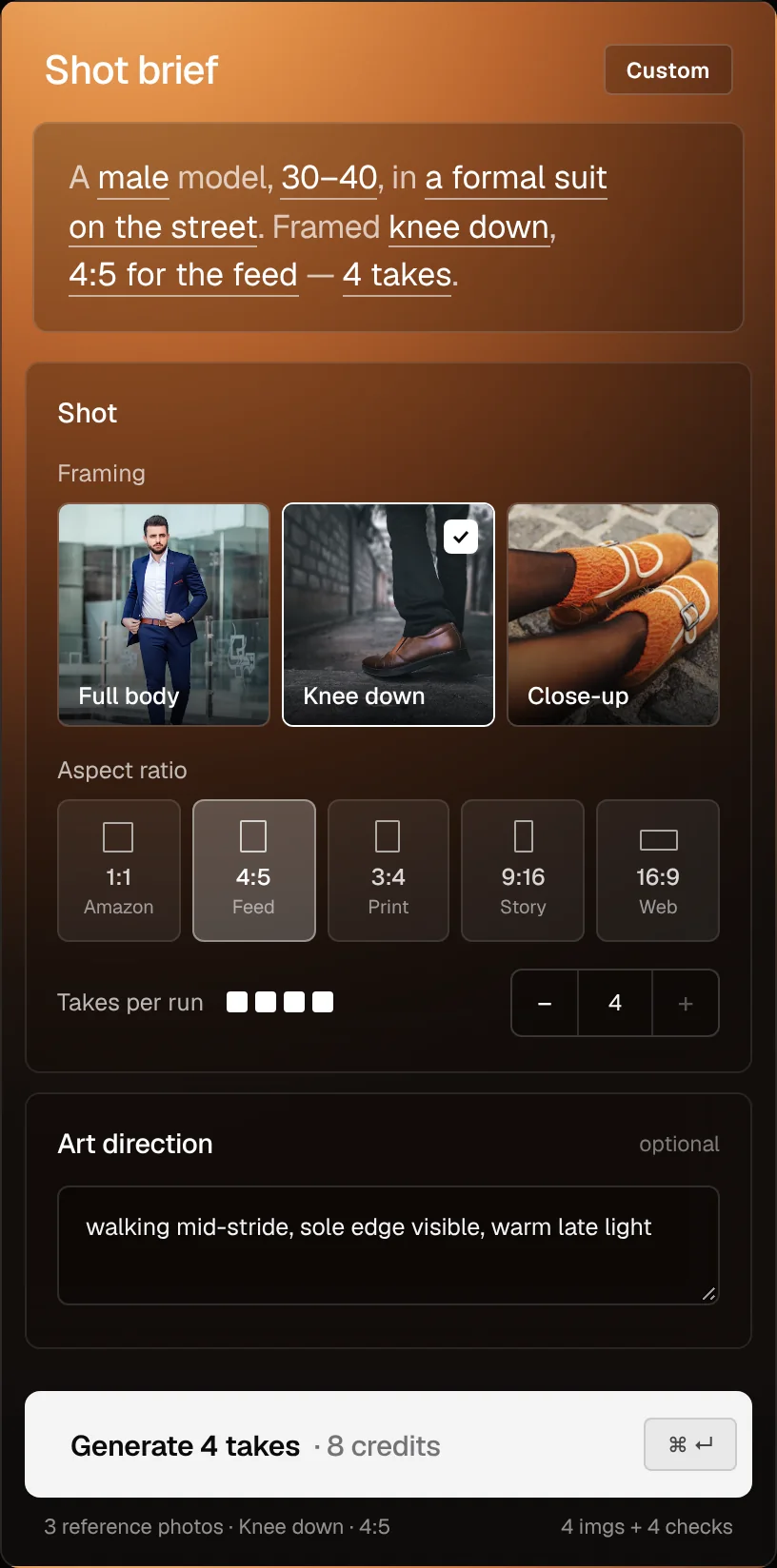
Nobody has to write a prompt. Teams pick outfit, model, scene and framing, read the brief back as one sentence, and OnFoot writes the prompt.
11 rewrites per usable image; teams gave up.
Visual choices, a readable sentence, saved presets.
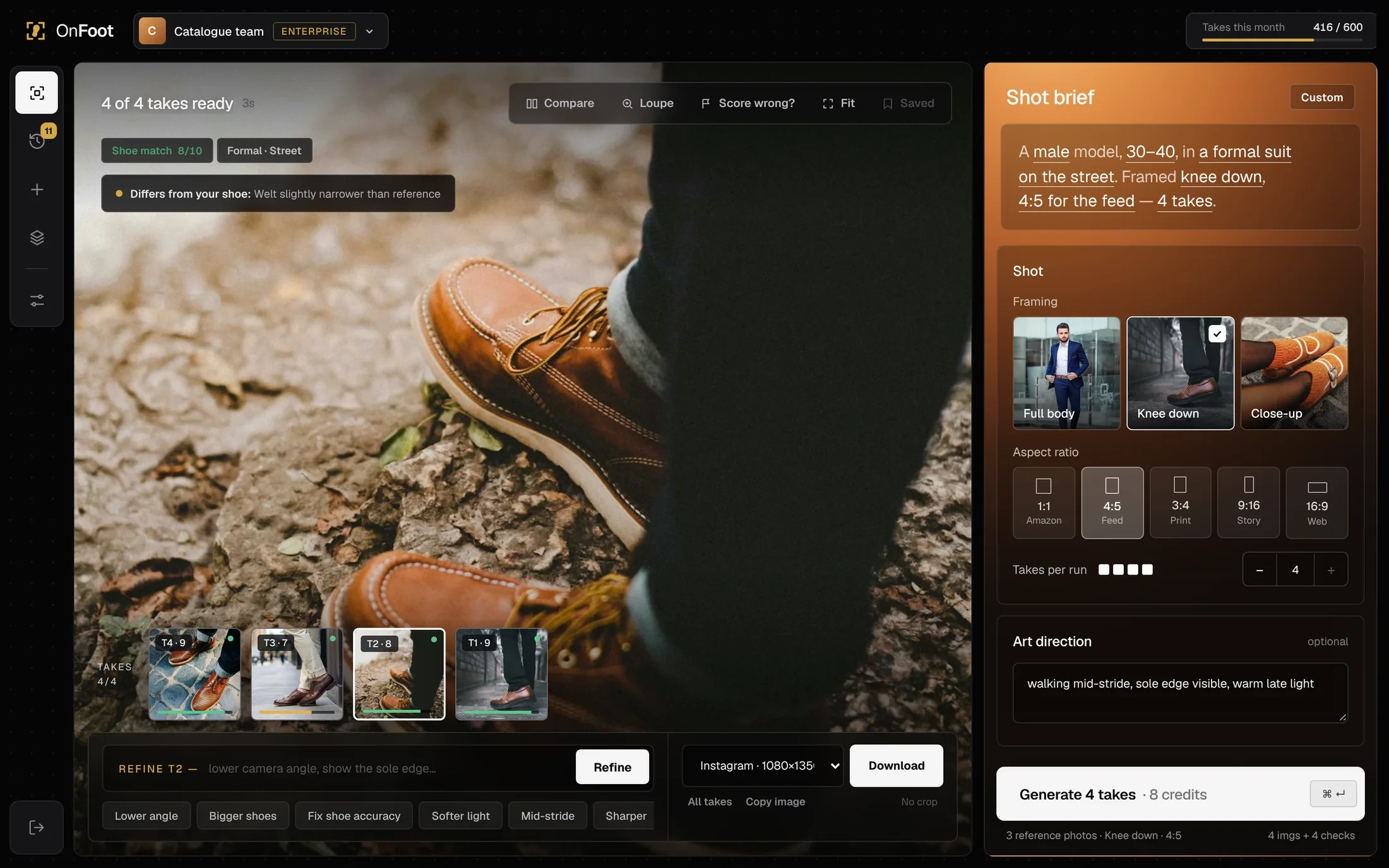
Every take is scored against the real product and the difference is named in plain words, so a wrong shoe is caught before anyone downloads it.
No tool had a review step; mistakes reached listings.
Automatic match score, colour bar, issue note.
Every free-text prompt was a guess. Designers rewrote prompts about 11 times per usable image, paying for retries even when the shoe drifted.
Different people wrote different prompts for the same shoe, so lighting, framing and model changed from image to image. A catalogue never looked like one brand.
Teams choose the outfit, model, scene, framing and channel through a guided brief. Those controlled choices reduce prompt rewriting and make the intended shoe and scene easier to verify.
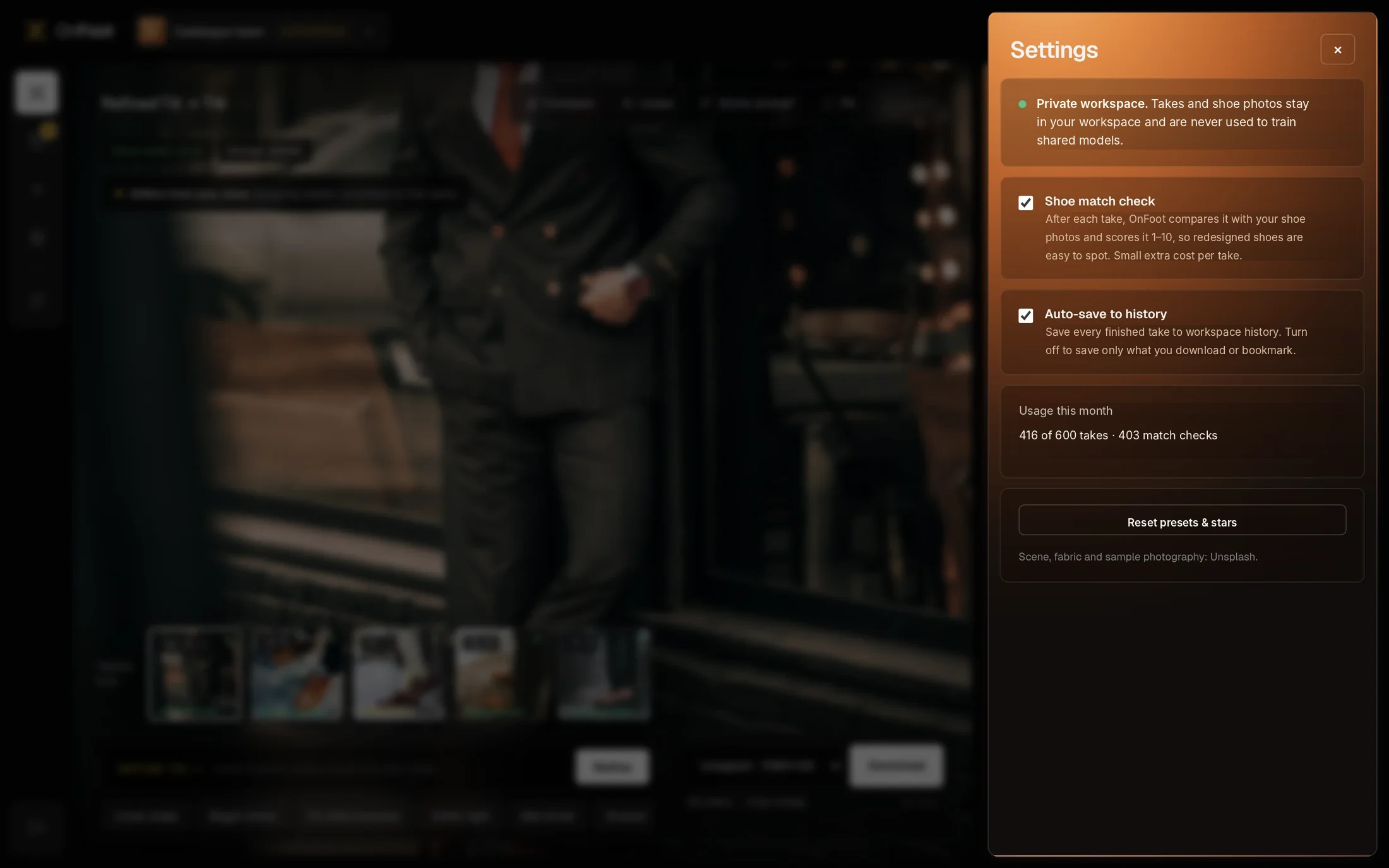
A card sort with eight participants put "make images" and "find images" far apart, and everything else under settings. The app keeps that shape: Studio, History and Settings, all scoped to a workspace.
The core loop. A refine sends the take back through the check, so nothing reaches export unscored.
I prototyped three directions at low fidelity and ran them with six users on the same task: "Create an Instagram image of this loafer on a model."
One big text field with the image below. Fast for experts; every novice stalled at the empty field. Task success 2 of 6.
Four steps, one choice each. Easy the first time, painful on the tenth run, because changing one setting meant walking back. 4 of 6.
Canvas left, brief right, takes in a strip. Everything visible at once, and settings stick between runs. 6 of 6, fastest repeat runs.
Good decisions still give something up. I logged the options, the choice and the trade-off I accepted, so the team could revisit any decision with the reasoning intact.
Flag with score and reason
Auto-delete / Hide / Flag and explain
WhyThe judge has blind spots; deleting would destroy good takes it misread
Trade-offUsers can still export a 6/10 take
8 out of 10
7 / 8 / 9
WhyBest balance in calibration: 5% false passes, 9% false flags
Trade-offSome acceptable takes get flagged
User chooses, default 2
1 / fixed 4 / 1–4 user choice
WhyVariety beats retries, but cost must stay visible and controllable
Trade-offAn extra decision before every run
1–4, with "more angles, closer match"
1 required / 1–4, encouraged / 4 required
Why3+ angles lifted match 6.4 → 8.1, but requiring 4 blocked teams with a single packshot
Trade-offSingle-photo runs score lower
Brief panel + optional note
Free prompt / Step wizard / Brief panel
WhyNovices succeeded 6 of 6; experts kept a free-text note for nuance
Trade-offLess creative range than a raw prompt
Photo tiles for outfit, model, scene and framing
Text labels / Line icons / Real photographs
WhyPeople picked the look they wanted in one go instead of guessing what "editorial" meant
Trade-offMore images to license and load
The take fills the canvas, near-black chrome, with a Fit toggle
Image in a framed card / Graphite surround / Full-bleed image
WhyReviewers judged faster when the take was as big as the screen; a frame and grey margins made shoes look smaller than on the product page
Trade-offControls sit on top of the photo and need scrims to stay legible
A copper gradient panel for the brief
Same dark panel as the canvas / Warm brief panel
WhySeparates "set up the shot" from "judge the shot" at a glance, and gives the product warmth without tinting the photo
Trade-offA second surface colour to maintain in every state
A full-bleed product photo with a slim form bar on the left
Split marketing page / One image + form bar
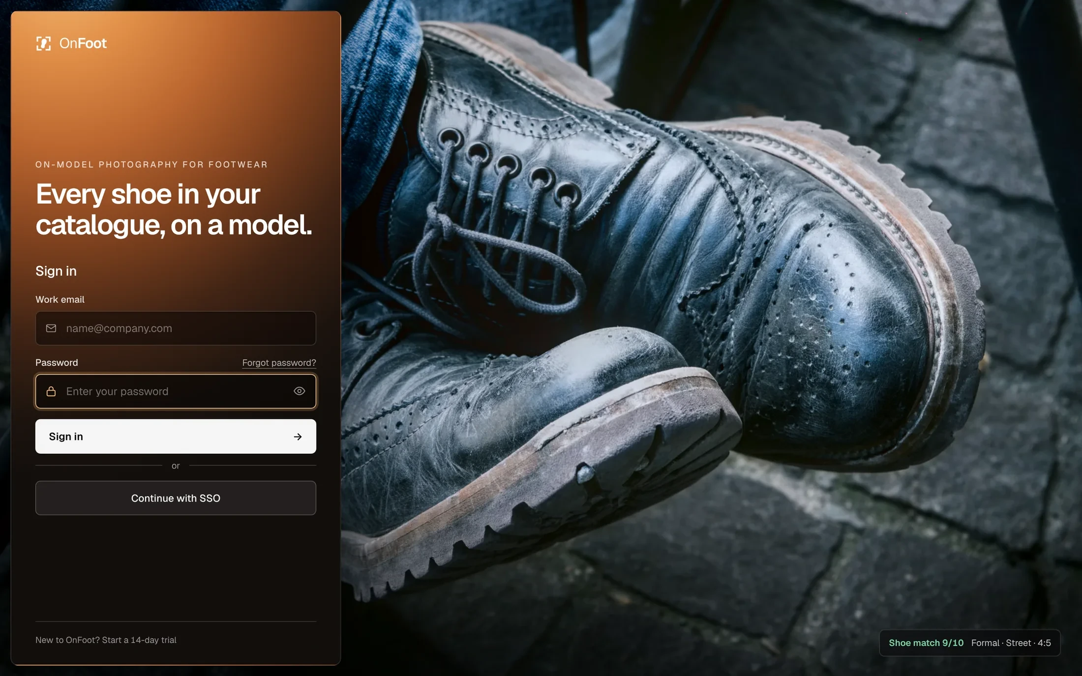
WhyShows the promise before any copy, and repeats the studio's layout so the app feels familiar on first load
Trade-offLess room to explain the product on that screen
Account, then workspace, then the studio
Sales call only / Two-step self-serve sign-up
WhyFootwear teams wanted to test on their own products before talking to sales; the workspace step sets default channels and export sizes
Trade-offSome enterprise leads skip the sales conversation
Takes per month
Seats / Takes / Images exported
WhyMaps to actual costs and how brands budget for shoots
Trade-offUsers ration exploration near the limit
The hardest design work happened off screen. Four DM Sans, a stakeholder wanted something reasonable that would have hurt the product. Each time I brought data they could check, offered a way to keep what they cared about, and let the result decide.
I did not want designers to accept AI output blindly. The shoe-match score is an internal quality check: inspect high scores, investigate uncertain ones and reject inaccurate takes. Each pattern below supports that decision before an image is published.
The button says 2 imgs + 2 checks and the brief states the frame and ratio before anything runs.
Users who know what's coming judge results fairly. Surprise reads as failure.
A shoe match score from 1 to 10, colour-coded at 7.5, on the image and in the takes strip.
One number turns "is this OK?" into a quick decision. It's about the shoe only, so it's honest about what it checks.
A plain reason under the score: "toe is more pointed than the reference", "sole colour differs".
A score without a reason gets ignored. A reason tells the user exactly what to look at, or what to refine.
Refining creates a new take beside the old one. Nothing is overwritten, nothing publishes itself.
Users experiment more when they know they can't lose a good result.
One-click fixes like Fix shoe accuracy and Lower angle, written as instructions, not prompts.
If recovering costs one click, a bad take is a small detour, not a reason to churn.
Exporting a take below 7.5 to a marketplace asks for a confirmation that names the issue.
The one moment a mistake reaches a customer gets a speed bump. Nowhere else does.
"Score looks wrong?" on every take. Flags go to a review queue and into the judge calibration set.
Users see their judgment counts, and the judge gets better on the shoes it gets wrong.
Exports carry "AI-generated" metadata and alt text written from the brief, ready for marketplace disclosure rules.
Brands carry the risk of a misleading listing. Disclosure built in removes a question from their legal team.
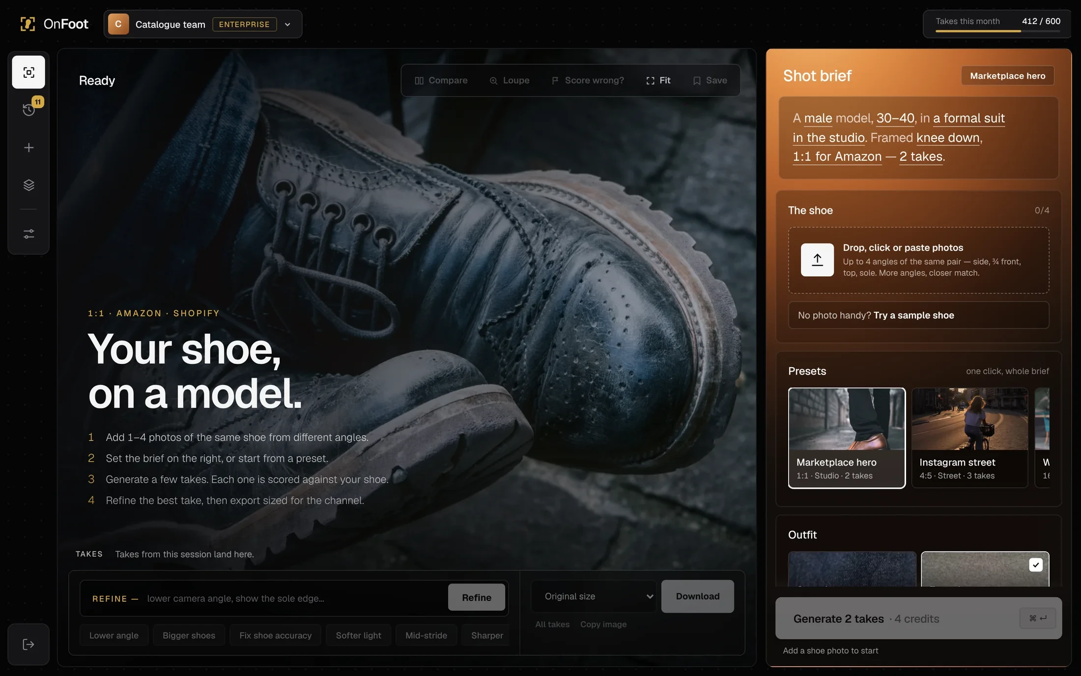
An enterprise studio for judging shots at catalogue scale, from the landing page and sign-up to export.
These are real builds, not redrawn mockups. Each was put in front of users and design partners, and each failed in a specific way that shaped the next.
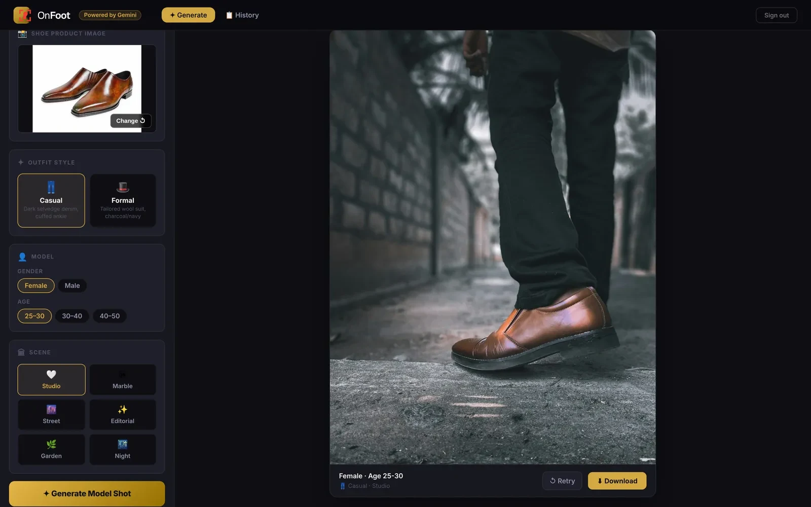
The first internal prototype. It worked for one person who already knew what to pick.
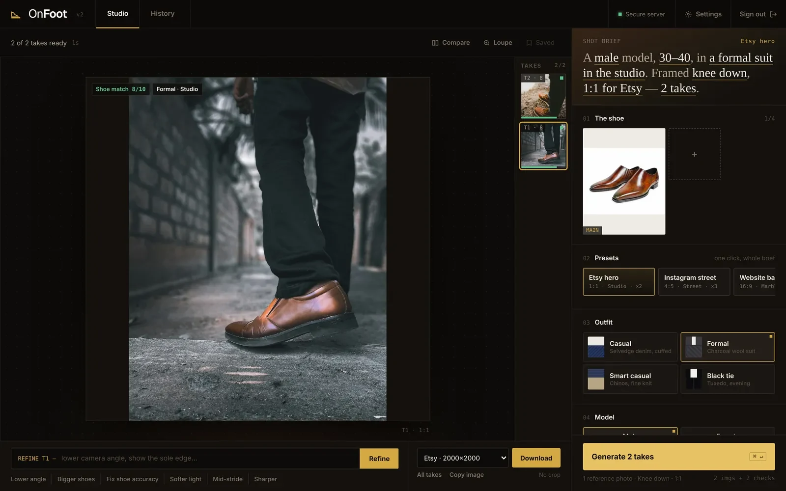
The core model arrived here: a readable brief, two takes per run, a shoe match score on every take.
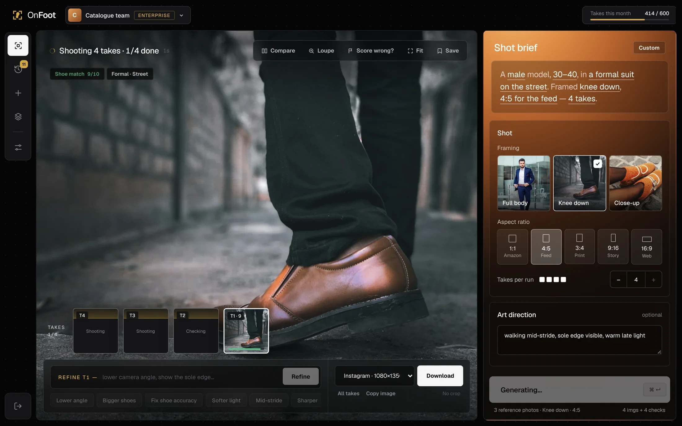
Same interaction model, rebuilt as SaaS: workspaces, seats and usage, export by channel. Visually, the take now fills the canvas, the chrome went near-black, the brief became one warm copper panel, and every option became a real photo.
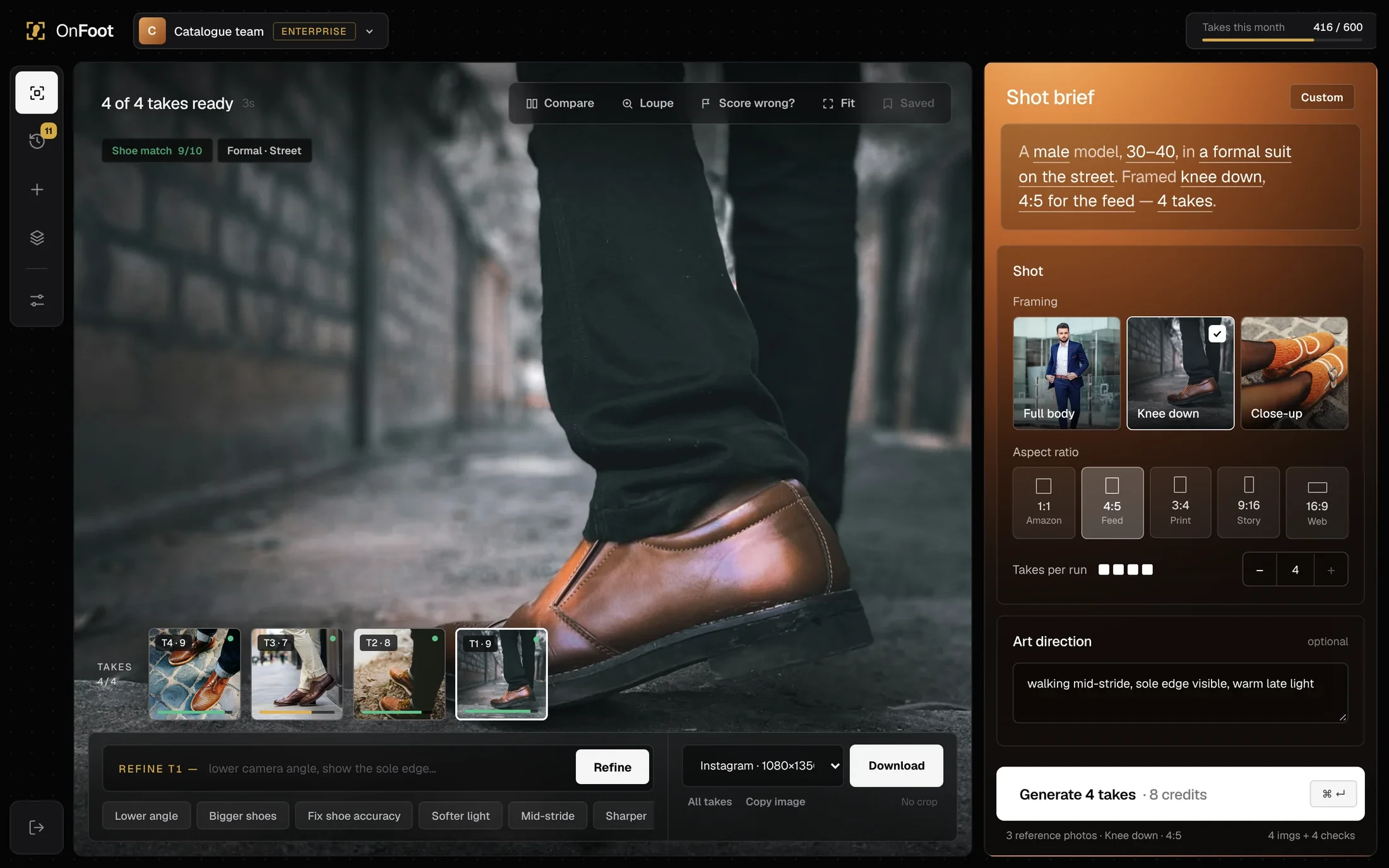
The take fills the canvas because judging the shot is most of the work. The brief sits on the right like an art director's sheet, in the one warm panel on screen, and takes collect in a strip along the bottom you can scan by colour.
Workspace and usageAI spend used to go untracked. Brand and monthly usage stay in view.
Brief sentenceCatch mistakes before spending a run. Tap any word to change it.
Shot controlsNo camera jargon. Framing shown as photos, ratios named by channel.
Match badgeCatches a wrong shoe before download, and says what changed.
Takes stripSee which takes passed at a glance, without opening each one.
RefineThe notes people kept typing became one-click fixes.
ExportCrops kept cutting the shoe off. Each size crops toward the feet.
GenerateShows the cost in credits before the click, so spend is a choice.
Review toolsThe check is wrong about 5% of the time. Compare, Loupe, "Score wrong?" and Fit let people verify.
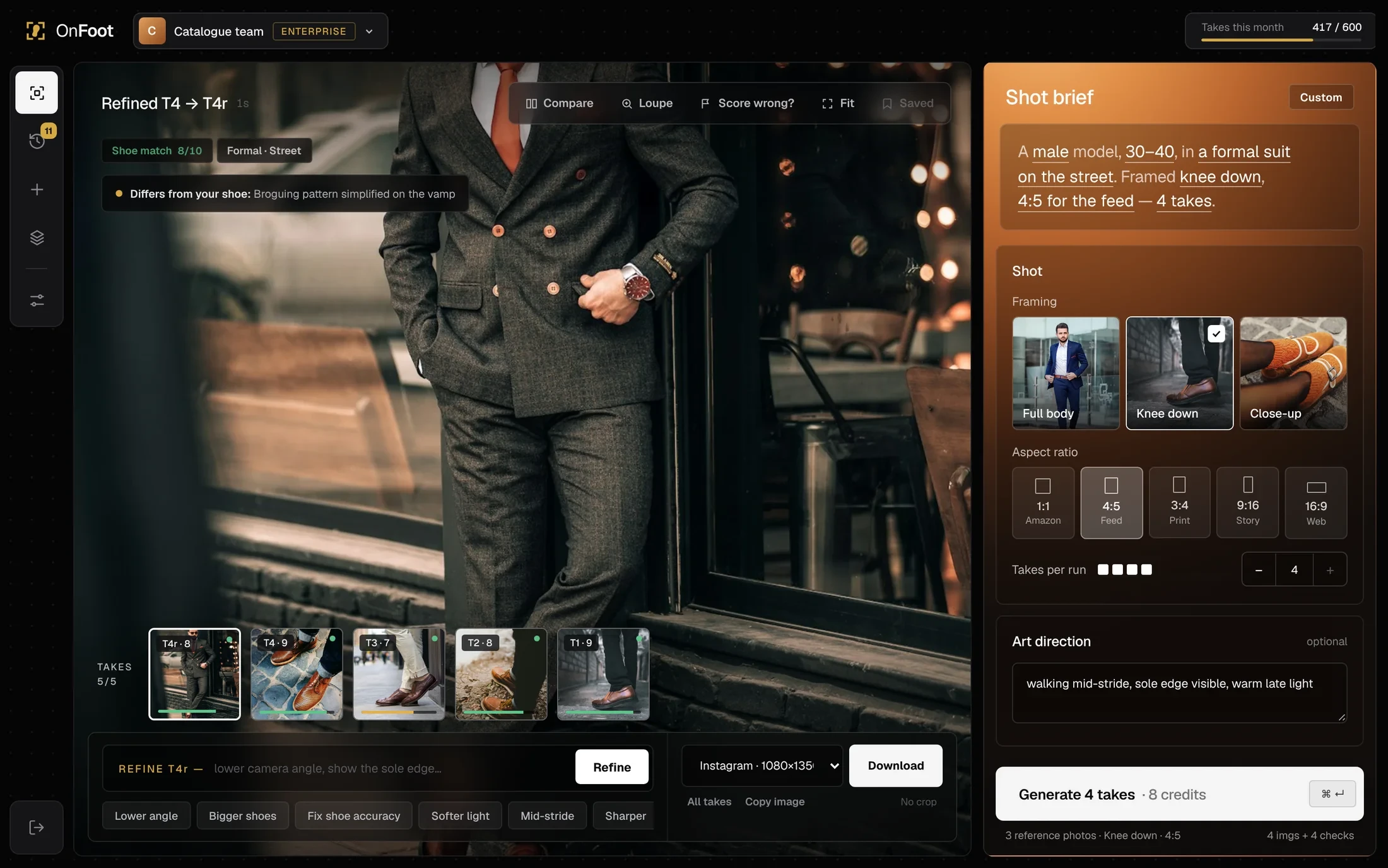
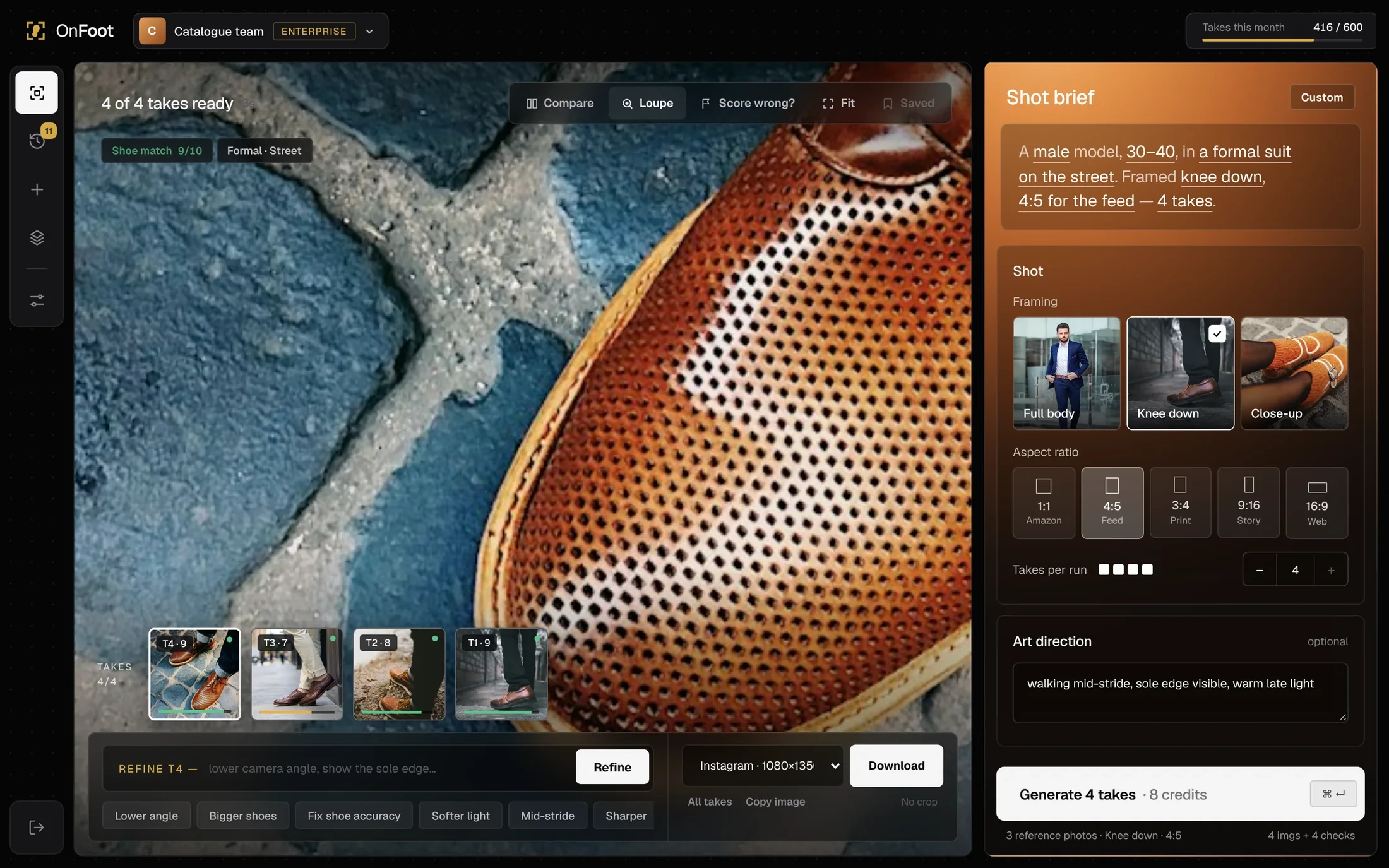
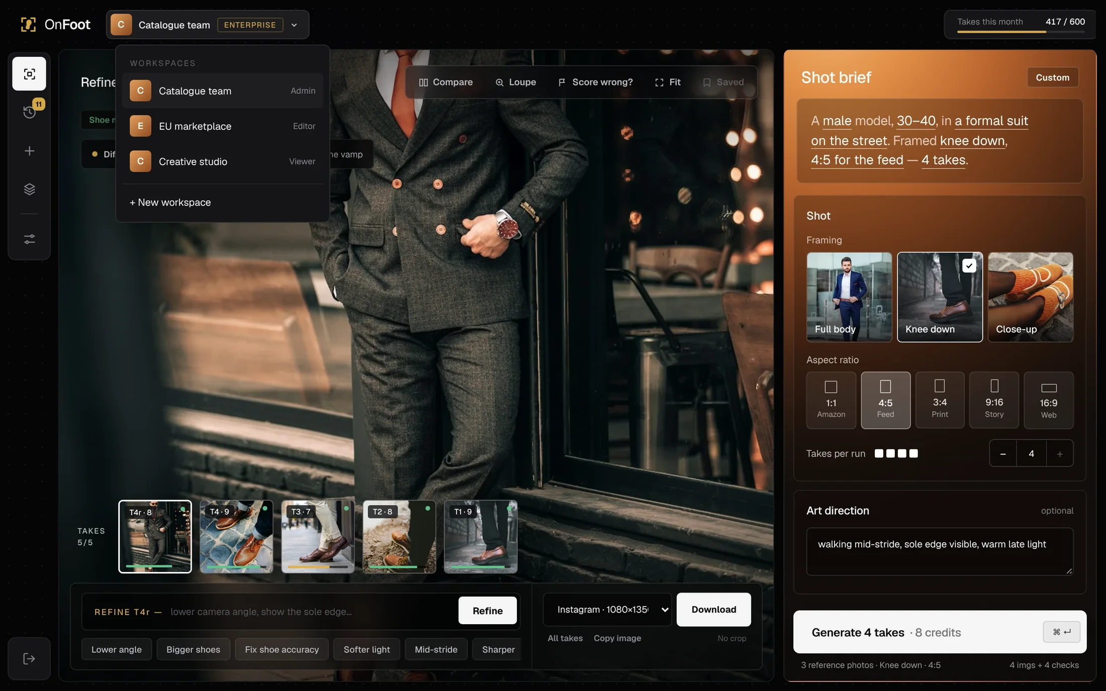
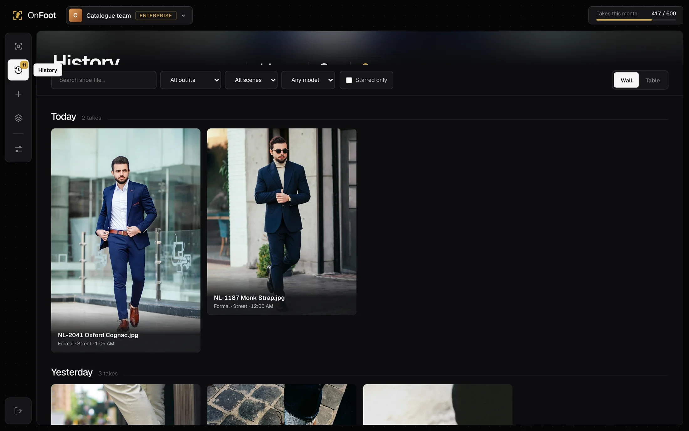
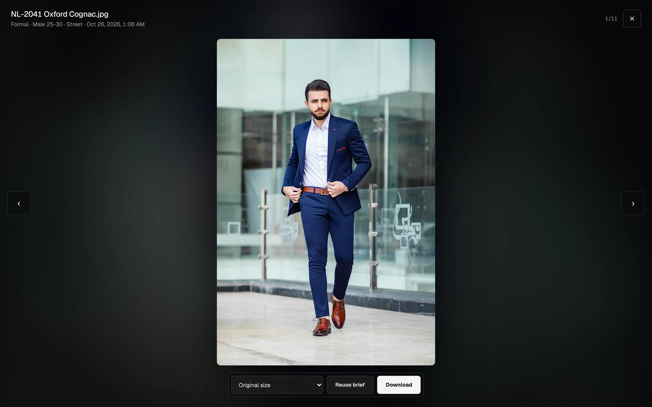
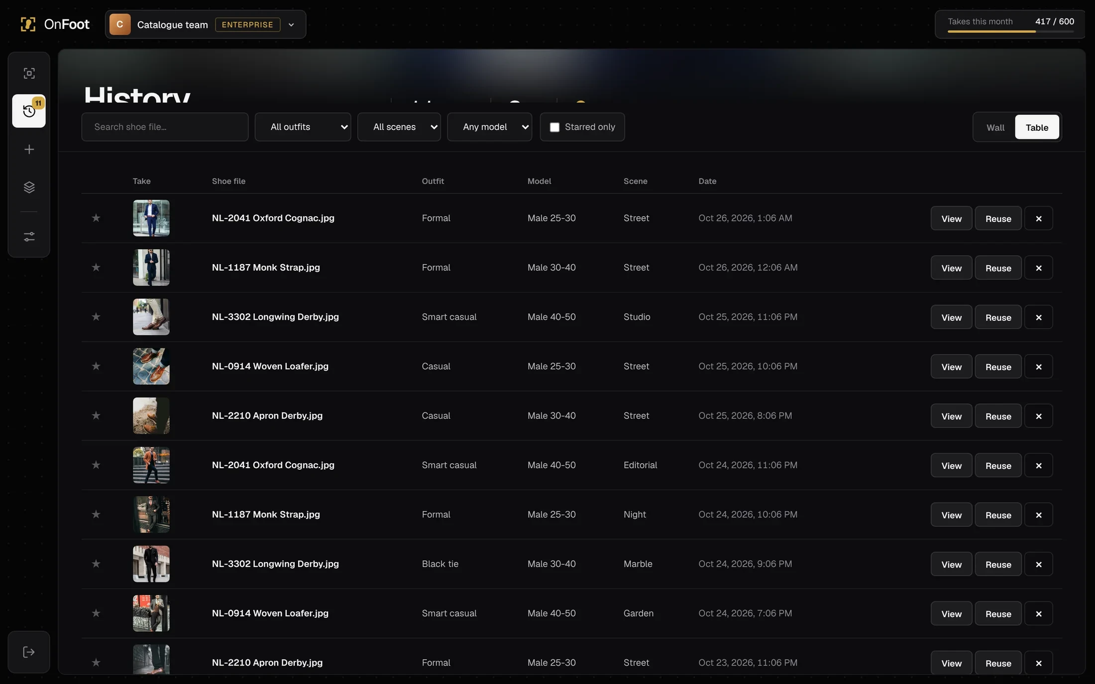
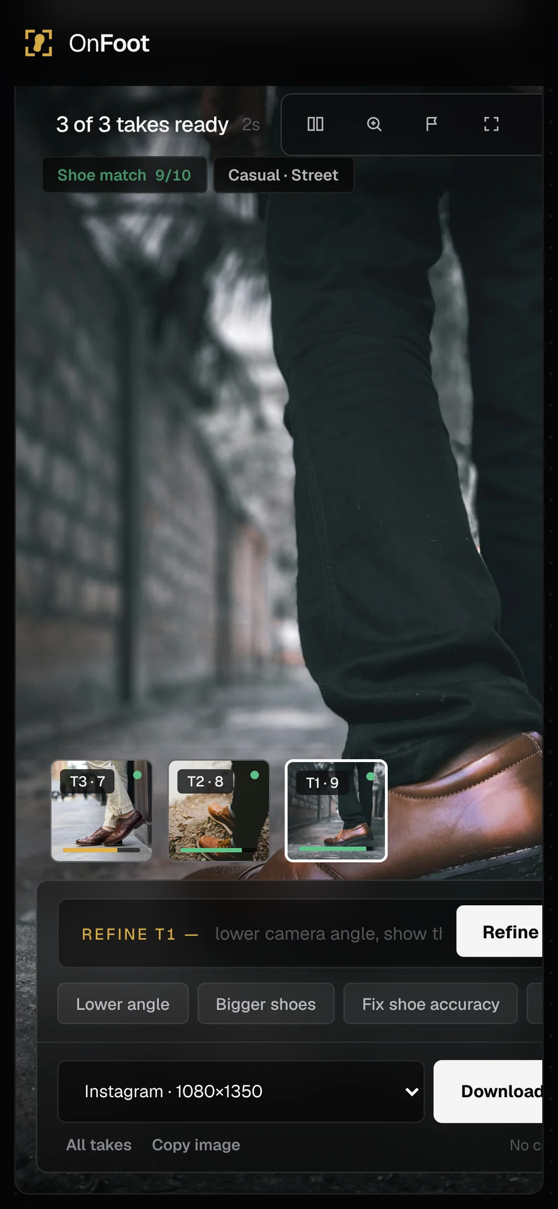
Merchandisers and approvers review takes between meetings and on the shop floor, so on mobile the brief comes first, takes are easy to compare, and Generate stays pinned to the bottom of the screen.
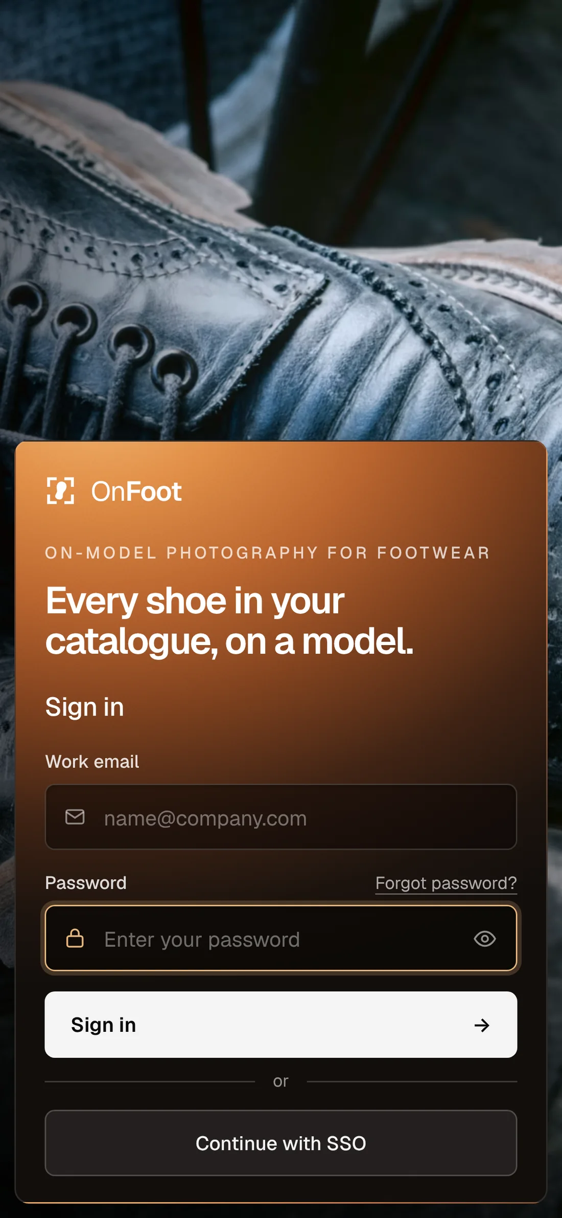
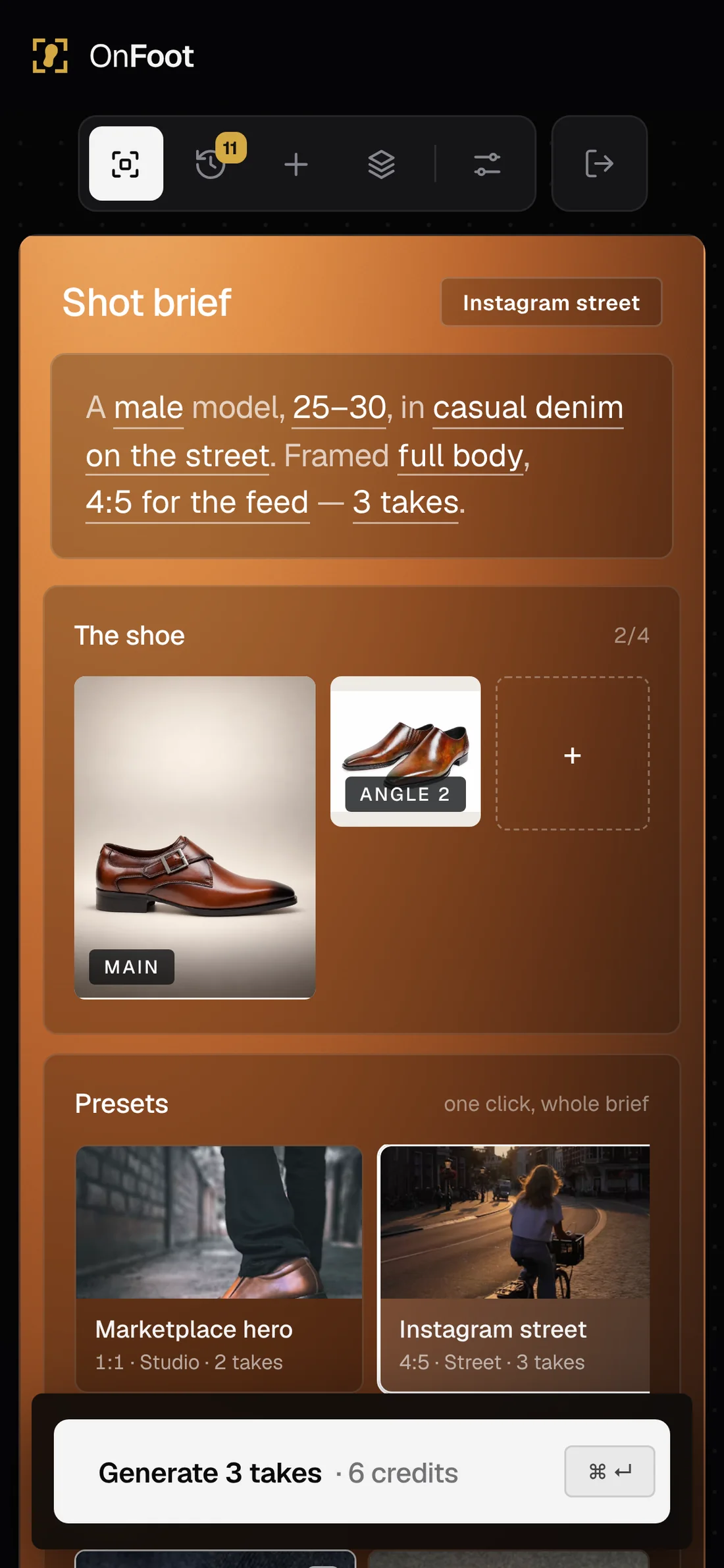
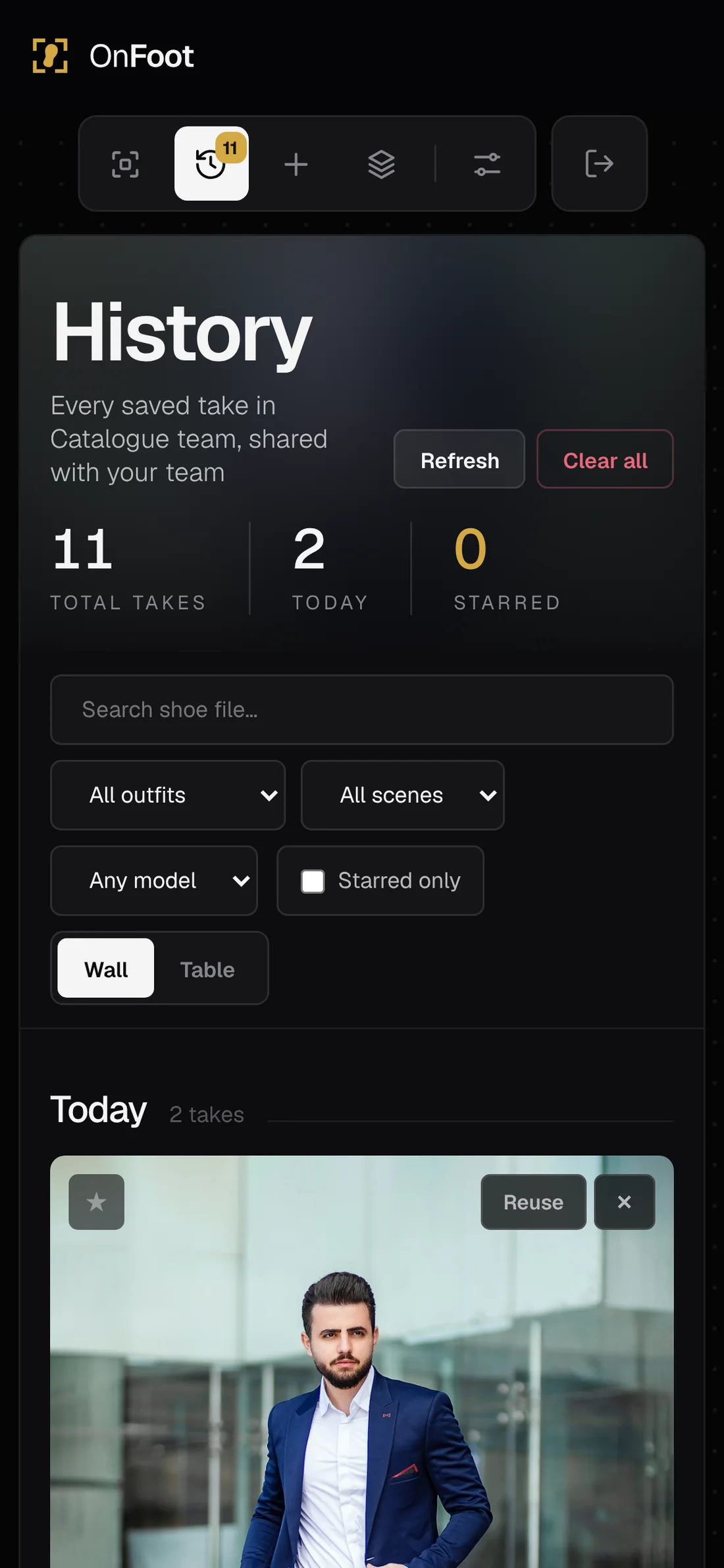
For a self-serve SaaS, the first session decides the trial. The risk was an empty studio and a new user staring at twelve options. So the first run is guided, pre-filled and short, and it ends with a real result, not a tour.
Channels set default ratios and presets, so the first brief already fits their store. Three fields, no team invite yet.
A sample product means nobody hits a blank state. 31% of trials started with it, and 70% of them uploaded their own shoe next.
The brief is pre-filled from their channel, as a sentence they can read. Every word is a control, but nothing has to change.
One tooltip, on the first take only, teaches the most important idea in the product. It's dismissed in one click and never comes back.
AI fails more often than ordinary software. Rate limits, blocked images and quota run-outs are everyday events, so each one has a designed message that says what happened and what to do next.
Shown before the run, not after.
One failure doesn't stop the batch.
A take is never lost silently.
Retries happen automatically.
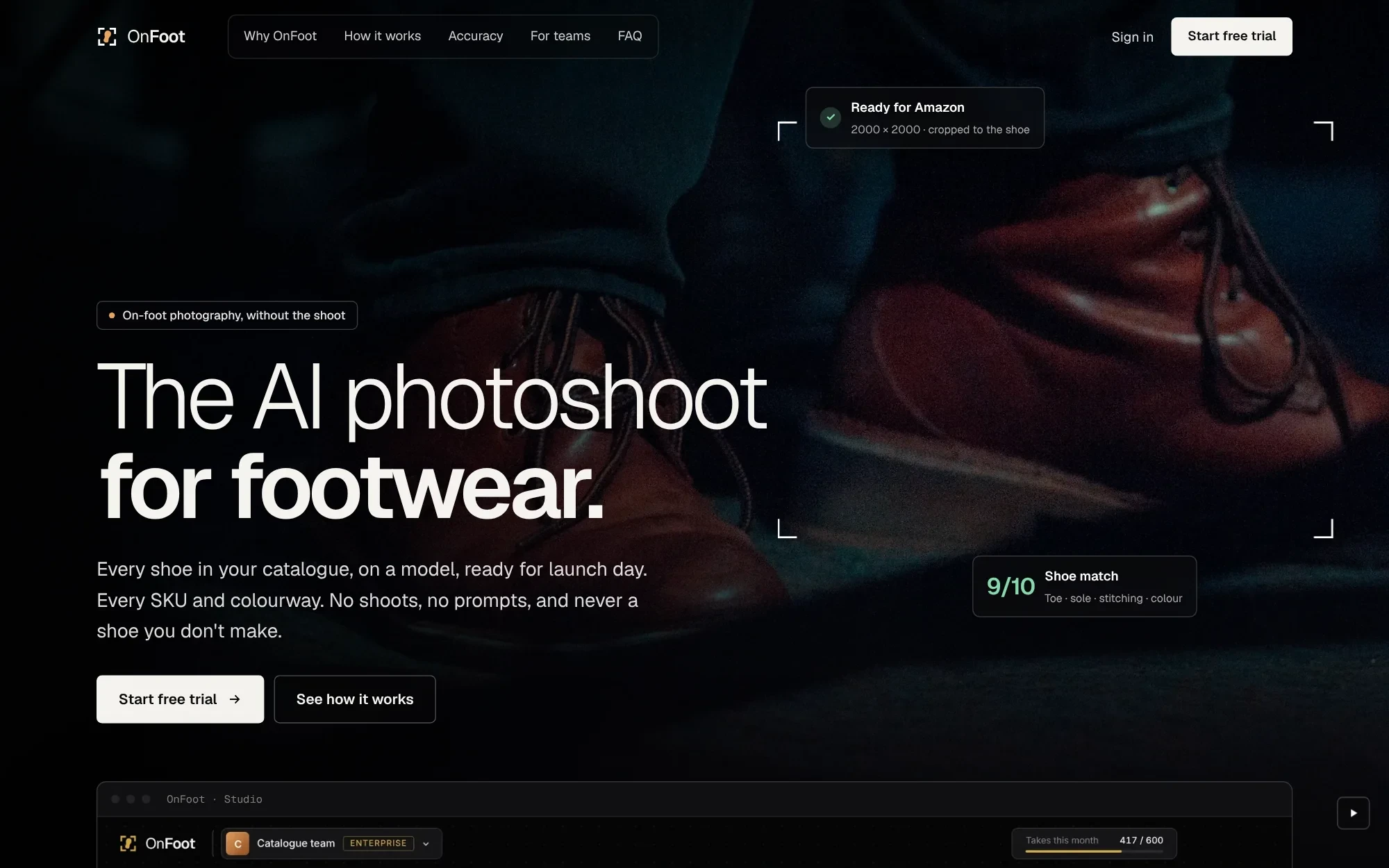
Brand buyers were tired of vague "AI magic" claims. The site leads with footwear imagery and clear production benefits; inside the product, designers see shoe-match scores and channel readiness before they approve an asset for use.

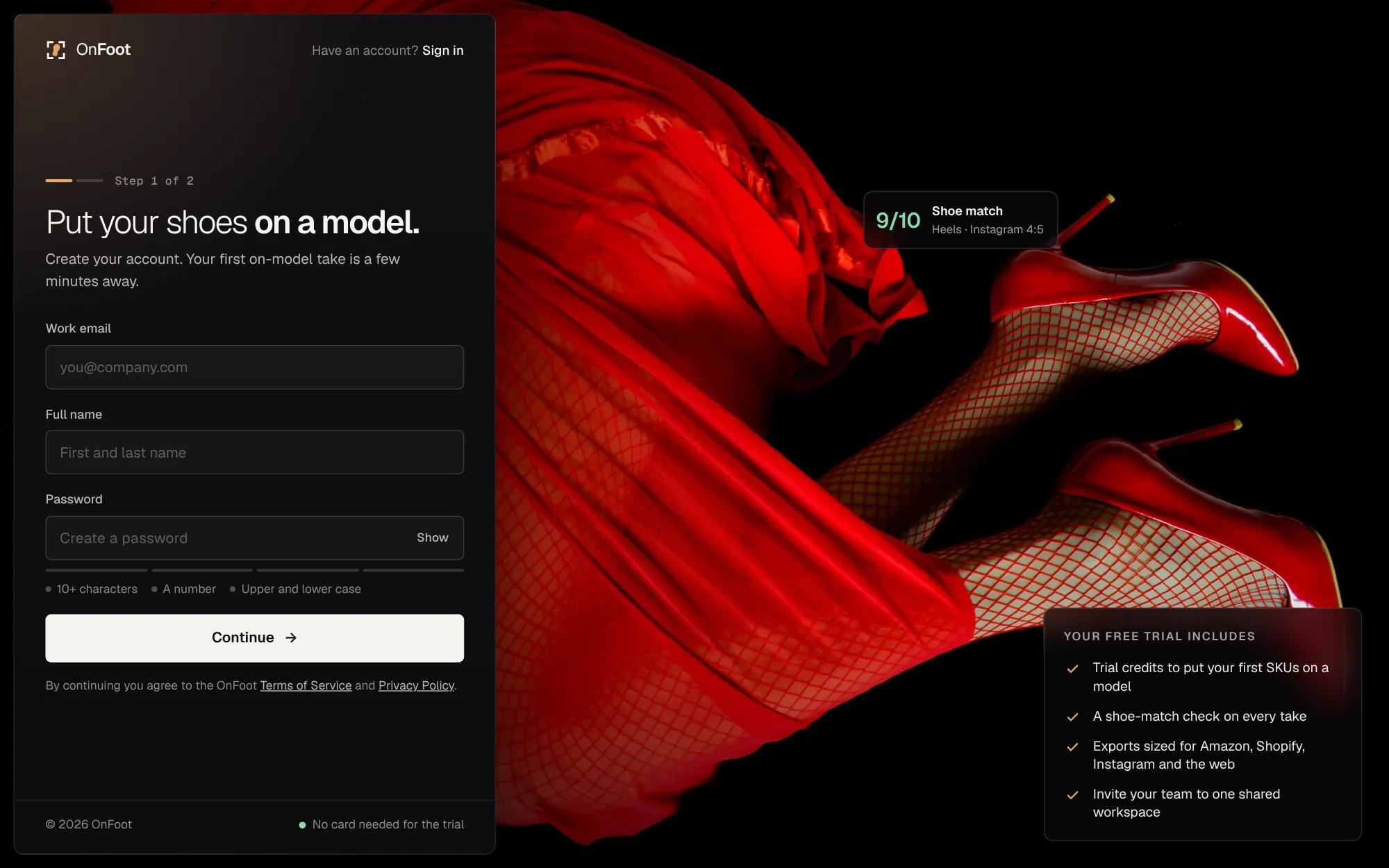
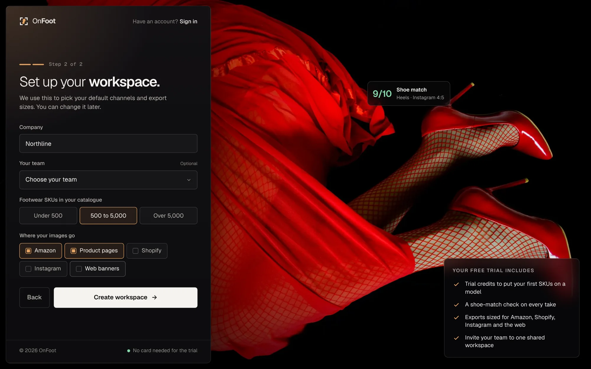
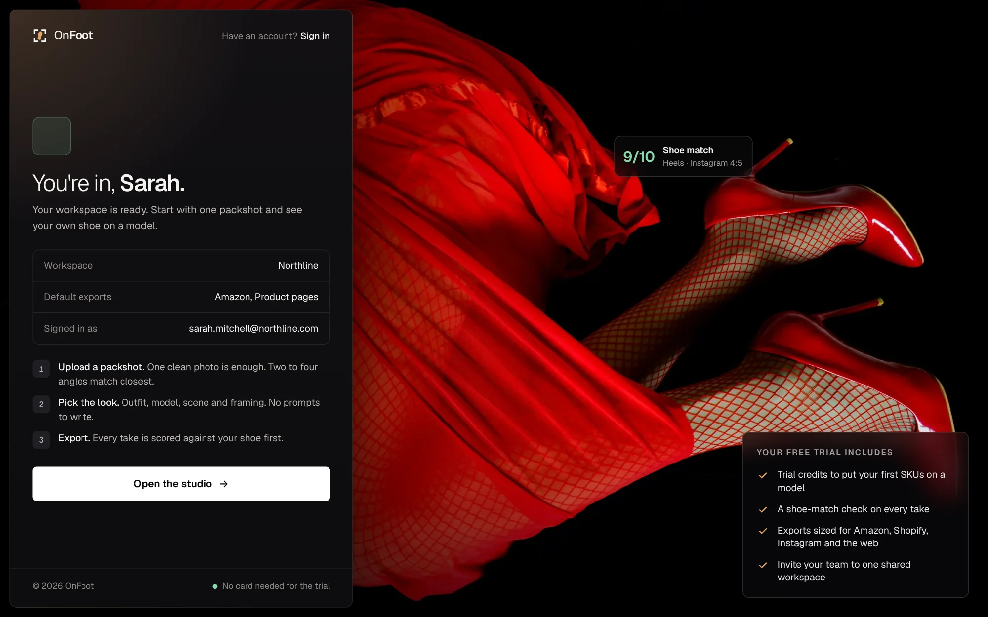
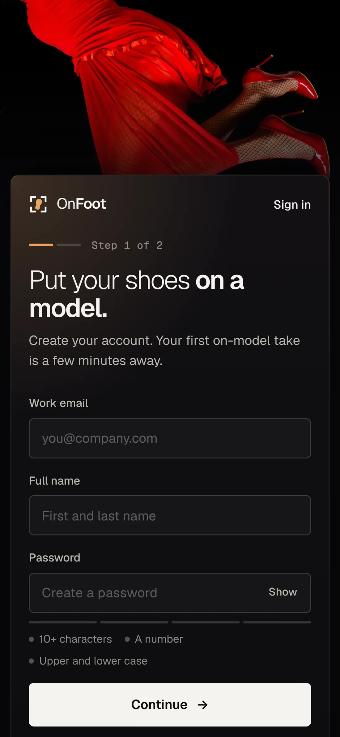
The trial is self-serve. Step one creates the account, step two sets up the workspace, so the studio opens with the right channels and export sizes already chosen.
OnFoot's job is to make someone else's product look right. The identity is deliberately quiet: one mark, one typeface, a near-black workspace where the generated image fills the canvas, and one warm copper surface for everything you set up. The shoe is always the loudest thing on screen.
Four crop corners around a single shoe sole, tilted mid-step: a viewfinder with a foot in it. It says "on foot" without a word, reads at 16px and works in a single colour.
Geist · one family for the whole product
The interface is a viewfinder. The take fills the canvas edge to edge, the chrome around it goes black, and the only warm surface is the brief, so your eye goes from the shoe to the decision and back.
Tight corners, thin dividers, real photography instead of icons, no italics, no pills. Precise and calm, like studio equipment.
OnFoot · AI on-model photography · B2B SaaS for footwear · 2026
The app has about twenty components. What made it feel solid was designing every state of each one: hover, selected, disabled, loading and failed. These are the ones that carry the product.
One component for outfit, model, scene and framing, each shown as a real photograph instead of a label or icon. Selection is a white border plus a check, which stays visible on any photo.
Four states. The score bar reads at a glance, so nobody has to open a take to know whether it's usable.
Checking T1 · 9
Semantic colour is used here and nowhere else, so green always means "safe to publish".
One white primary per view, with the cost of the run written on it. Destructive actions are outlined red and always ask to confirm.
Four near-black surfaces, one warm gradient, one brass accent and three semantic colours.
4px base grid. Corners are 6px on controls, 8px on cards and 10px on panels. An early round used 20px corners and capsule buttons; users called it "an app for consumers", so we tightened them. No pill shapes.
Every generation costs money and takes time, so actual model capabilities shaped my design from the start. I set a budget in week 3 (under 45 seconds and under $0.25 per listing-ready take) and every interaction was checked against it.
The same names in Figma variables and in CSS, so a design change is one edit.
Written per component, with every state and the edge cases engineering asked about.
Measured on takes good enough to sell with, not on images generated.
The whole product rests on the match score, so I tested it like a measuring instrument. Three footwear specialists rated 400 takes blind, and I compared their consensus with the AI judge.
Where it fails: colour shifts under warm scene lighting, and lace colour on dark shoes. Both are now named in the issue note so a human looks twice.
What it means for the design: the score flags, it never deletes. Compare and Loupe exist for the 5% the judge gets wrong.
Ongoing: 2% of production takes are sampled weekly for human review, so drift in the judge shows up before customers see it.
Moderated sessions on the working build, with participants' own products. Each round used the same three tasks so results could be compared.
| Task | Round 1 · 5 people | Round 2 · 5 people | Round 3 · 4 people |
|---|---|---|---|
| Make a listing-ready image for Amazon | |||
| Spot the take with hallucinated shoe details | |||
| Fix one take and export for Instagram | |||
| Median time to first usable image | 9 min 40 s | 6 min 10 s | 3 min 50 s |
| System Usability Scale | 64 | 77 | 86 |
Round 1 showed "Accuracy 0.74". Nobody knew if that was good, and two people downloaded a take where the toe had changed.
 Accuracy 0.74Match 7/10
A score out of 10, a colour bar, and one sentence naming the difference.
With five takes on screen, three people refined a different take from the one they meant.
The refine bar names its target, and the result arrives as a new take.
Centre crops for 1:1 removed the feet from portrait takes, which is the most important part of the image.
Crops are weighted to the lower third, and the ratio is chosen before generating.
After a few changes, users couldn't recall what they'd asked for and re-checked every section.
The brief sentence reads the setup back. Time to verify settings fell from 22 s to 4 s.
Results from the eight-week beta, with three design partners and eleven footwear companies on trial.
average shoe match across 41,000 beta takes
of new workspaces made a usable image in their first 10 minutes
lower cost per on-model image than a shoot day
System Usability Scale score in the final round
Weekly, eight weeks either side of launch. Same products, same prices.
OnFoot turned on-model photography from a quarterly project into something a team does the day a product is ready.
The guided brief made creation easier for designers, while the internal shoe-match check helped them catch altered product details before approval. Together they made catalogue production more repeatable, without asking customers to evaluate AI accuracy.
"Images generated" would reward bad takes and endless retries. The metric that matches the value a brand gets is a take good enough to sell with. Everything else is an input to it, or a guardrail on it.
Listing-ready means a shoe match of 7.5 or above, exported to a channel. It only goes up when the product does its job.
Events were defined with the engineer during handoff, so the metrics existed on day one of beta instead of being reconstructed later.
I didn't add features just because I could. Each part of the product answers a specific problem I found, with a measure of whether it worked.
| Problem | Evidence | Design decision | Outcome |
|---|---|---|---|
| AI changes the product | 68% of AI outputs hallucinated shoe details; best model still 1 in 3 | Multi-angle references, locked prompt, automatic match check | 87% average match; 5% false passes |
| Teams can't review at scale | Human review accuracy fell to 61% after 15 images | Score bar on every thumbnail, issue note, Compare and Loupe | "Spot the changed shoe" task: 2/5 → 4/4 |
| Prompting is a skill barrier | 11 rewrites per usable image; 8 of 8 teams quit | Brief panel, readable brief sentence, presets | First usable image: 9 min 40 s → 3 min 50 s |
| Images break across channels | 54% lost the shoe when cropped for a second channel | Ratio chosen before generating; shoe-weighted export crops | Zero cropped-shoe exports in round 3 |
| Fixes land on the wrong image | 3 of 5 testers refined the wrong take | Refine bar names its target; result saved as a new take | Fix-and-export task: 2/5 → 4/4 |
| Agencies mix client assets | Studio leads kept separate folders and logins per client | Workspaces with roles, plans and separate history | 3 agencies in beta, 21 client workspaces |
An AI image that shows the wrong product is a misrepresentation, whatever it looks like.
Defaults decide who appears on thousands of listings.
Studio leads worried the tool would replace them.
Unreleased designs are commercially sensitive.
Version 1 hid takes below 7. Users lost good images the judge misread and stopped trusting the tool.
Lesson: let the system advise, let people decide.
I tried letting the AI expand short notes into full briefs. Results drifted from intent and nobody could tell why.
Lesson: keep what the user asked for visible and literal.
Early runs made one image at a time. People retried endlessly and costs rose with no extra quality.
Lesson: give variety up front, priced openly.
What didn't work. Each failure shaped a principle that's still in the product.
What I learned about designing with AI. The biggest decision was refusing to make OnFoot a better prompt box. A simple brief and a visible check did more for adoption than a better model.
Taking prompt writing away raised image quality and people's confidence at the same time. A few clear choices beat a blank text box, and gave the same look every run.
The match score was a small build and the most-used feature. People trusted the tool more once it could say "this one's off, and here's why", not less.
Every session used participants' own products. Stock or sample images would have hidden AI hallucinations affecting the shoe until launch.
Version 1 hid takes scoring below 7. The check wrongly flagged 9% of good takes, so people lost images they would have used and stopped trusting the tool. I'd start with flagging from day one.
"Quality 8/10" was read as a grade for the photo, not a check on the shoe. Renaming it "Shoe match" fixed it, but two rounds of results were muddied by the wrong word.
Design partners' catalogues were beautifully shot, but many teams upload quick phone packshots. The match check struggled with those in beta. I'd add messy photos to the test set from week one.